Case study · Non-profit
A home with soul for Streets of India.
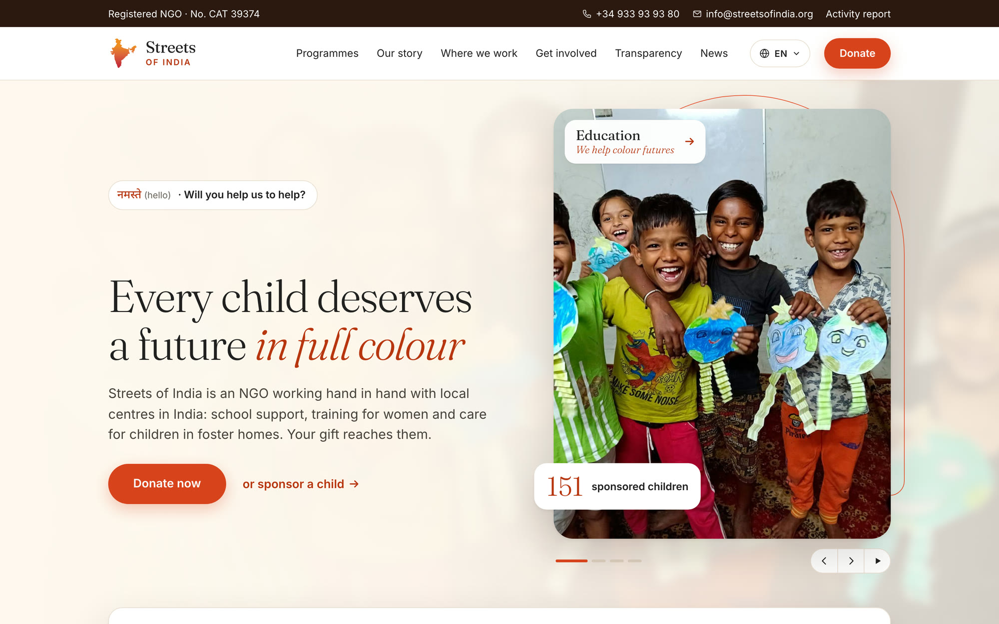
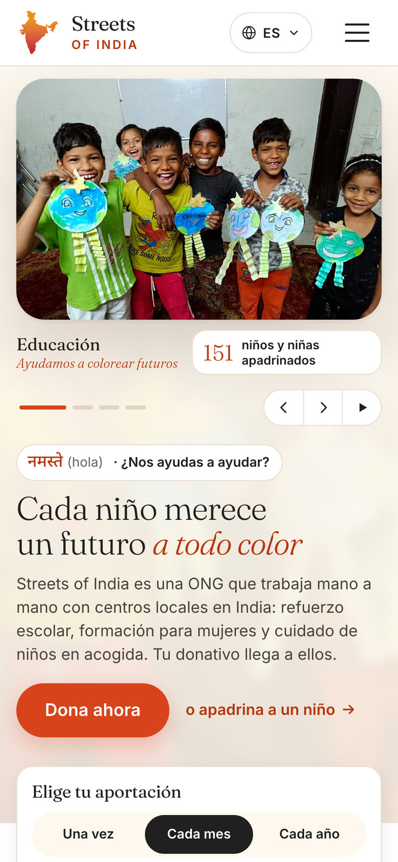
We rebuilt a 20-year-old NGO website in four languages, kept every page and gave it a design drawn from India.
- Client
- Streets of India, registered NGO
- Where
- Barcelona and partner centres in India
- Services
- Strategy, UX, visual design, build, migration, translation
- Year
- 2026
- 4languages: Spanish, English, Indonesian and Hindi
- 109pages live, with not one old page lost
- 53news stories from 2019 to 2026 brought onto the site
- 16Indian icons and motifs drawn in the brand's colours
Twenty years of work. A website that looked like any other.
Streets of India began in 2004 with a journey and a conviction: you cannot look the other way. Today it works with partner centres in Delhi, Jabalpur and Surat Nagar on schooling, care for children with disabilities and training for women.
Its website is where people in Spain decide whether to give, volunteer or partner. It had stopped telling that story. Updates lived on Instagram, the template could have belonged to any charity, and giving took more effort than it should.
Visiting the website should feel like walking into one of the centres.
- 01
Not secure
No valid HTTPS certificate, so browsers warned visitors before they saw a single photo.
- 02
A generic template
Stock photos, round icons and a dated logo said little about the people in India.
- 03
News stuck on social media
Since 2019 every update lived only on Instagram and Facebook. The site looked silent.
- 04
Poor translations
The Indonesian and Hindi pages were automatic translations that read badly.
- 05
Giving was hard work
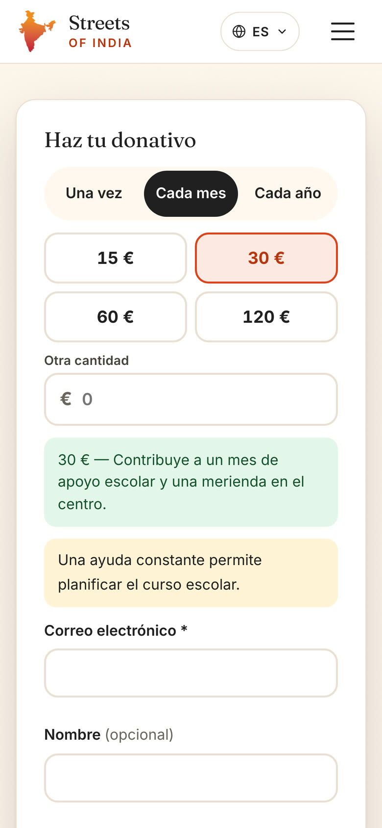
Donations ended in email links instead of one clear path.
Before and after.
Drag the handle to compare the old home page with the new one at the same screen size.
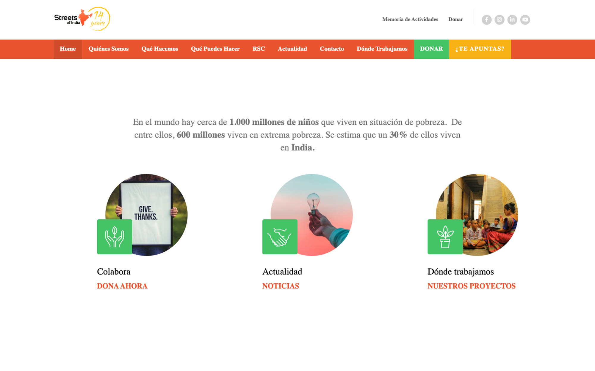
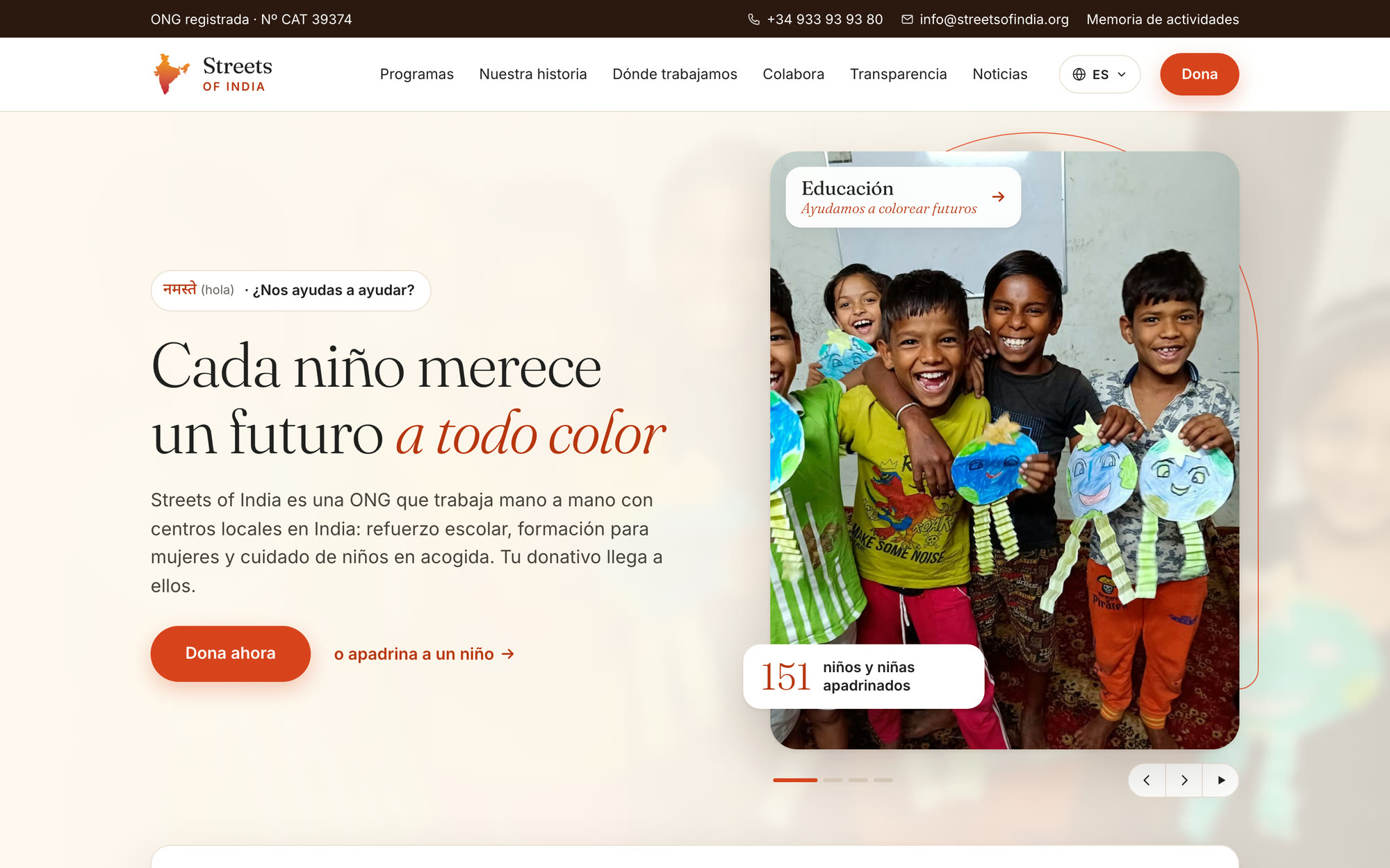
Before: streetsofindia.org, from the public web archive, January 2025. After: the new site, November 2026.
How we worked.
Every decision passed one test: it must come from the reality of India, say something about Streets of India and never get in the way of someone who wants to give.
- 01
Listen
Conversations with the team and a study of the old site, then a review from five angles: Indian creative direction, the donation journey, photography, accessibility and a donor in Spain.
A shared brief and photo rules - 02
Find real sources
Motifs taken from India's everyday crafts and architecture: block-print, kolam, jaali, jharokha and khadi. No postcard clichés.
16 icons and motifs - 03
Set rules
Brand colours only, one fine 1.5 px line, nothing over faces or next to a donate button, each motif in one place.
A concept board the team approved - 04
Build and move
A fast static site from one set of content files, every old page and post carried over, four languages from one source.
109 pages, 0 missing - 05
Test and launch
Checked on phones and desktops for contrast, reading size and speed, then launched with redirects for every old address.
Live on HTTPS
Design language
India, drawn in the brand's own colours.
The old site used generic interface icons. We drew a new set where each icon carries a real Indian motif, and eight ornaments that each live in exactly one place.
Eight ornaments, each in one place
Our programmes
Four ways to change a life
O1Buta divider
- Origin
- The buta, or paisley, a seed shape found in Indian textiles for centuries.
- Why
- A seed that grows, like a donation.
- Where
- Under the headings of three key sections.
O2Jharokha arch
- Origin
- The balcony windows of Rajasthan's havelis, looking out onto the street.
- Why
- The main photo is a window into the centres.
- Where
- One orange line behind the home photo and page headers. The photo is never cropped.
- 151sponsored children
O3Jaali corners
- Origin
- The jaali, a carved stone lattice that lets in light and air.
- Why
- Transparency: donors see what happens with every euro.
- Where
- Figure cards, the Saraswati quote and results.
- 01१Choose your amount
- 02२It reaches India
- 03३We tell you
O4Devanagari numerals
- Origin
- Numbers in Devanagari, the script of Hindi.
- Why
- Two languages counting the same steps: Spain and India together.
- Where
- The steps of How it works.
What we have achieved together
O5Block-print border
- Origin
- Wooden-block printing, the craft of the Hands of Light workshops.
- Why
- It brings the women's handmade work onto the site.
- Where
- Only above the photo mosaic and the footer.
Get involved
Ways to help
O6Dabu band
- Origin
- Dabu, a hand mud-resist print from Rajasthan, usually dyed indigo.
- Why
- The technique is Indian, the colour is the brand's orange.
- Where
- Background of the Ways to help section.
Why we exist
O7Khadi texture
- Origin
- Khadi, hand-spun cloth and paper, a symbol of self-reliance.
- Why
- Self-reliance is what the programmes for women aim for.
- Where
- Every cream section, very subtly.
Streets of IndiaRegistered NGO · No. CAT 39374
O8Kolam seal
- Origin
- Kolam is drawn at the door of South Indian homes every morning as a welcome.
- Why
- A door that is always open.
- Where
- Once, in the footer, as a sign-off.
Brand colours
- Orange
#EA5531Accents, buttons - Yellow
#FCB216Rings, fine threads - Green
#45C267Trust - Ink
#202020Icons, text - Cream
#FFF8EFBackground
Type
- Fraunces LightHeadings
- InterReading text
- नमस्तेDevanagari details, always translated
We avoided
- Elephants, the Taj Mahal and travel clichés
- Mandalas behind text
- Religious symbols
- Black-and-white photos of children as a before
- Volunteer-as-saviour images
- Fake Hindi-style typefaces
We looked for
- The women's embroidery and sewing
- The wooden blocks of the Hands of Light workshops
- Lattices that let the light in
- Welcome drawings at the door
- The places where children learn
What we built.
Real children, real centres, one clear ask.
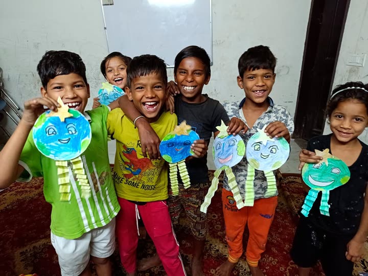
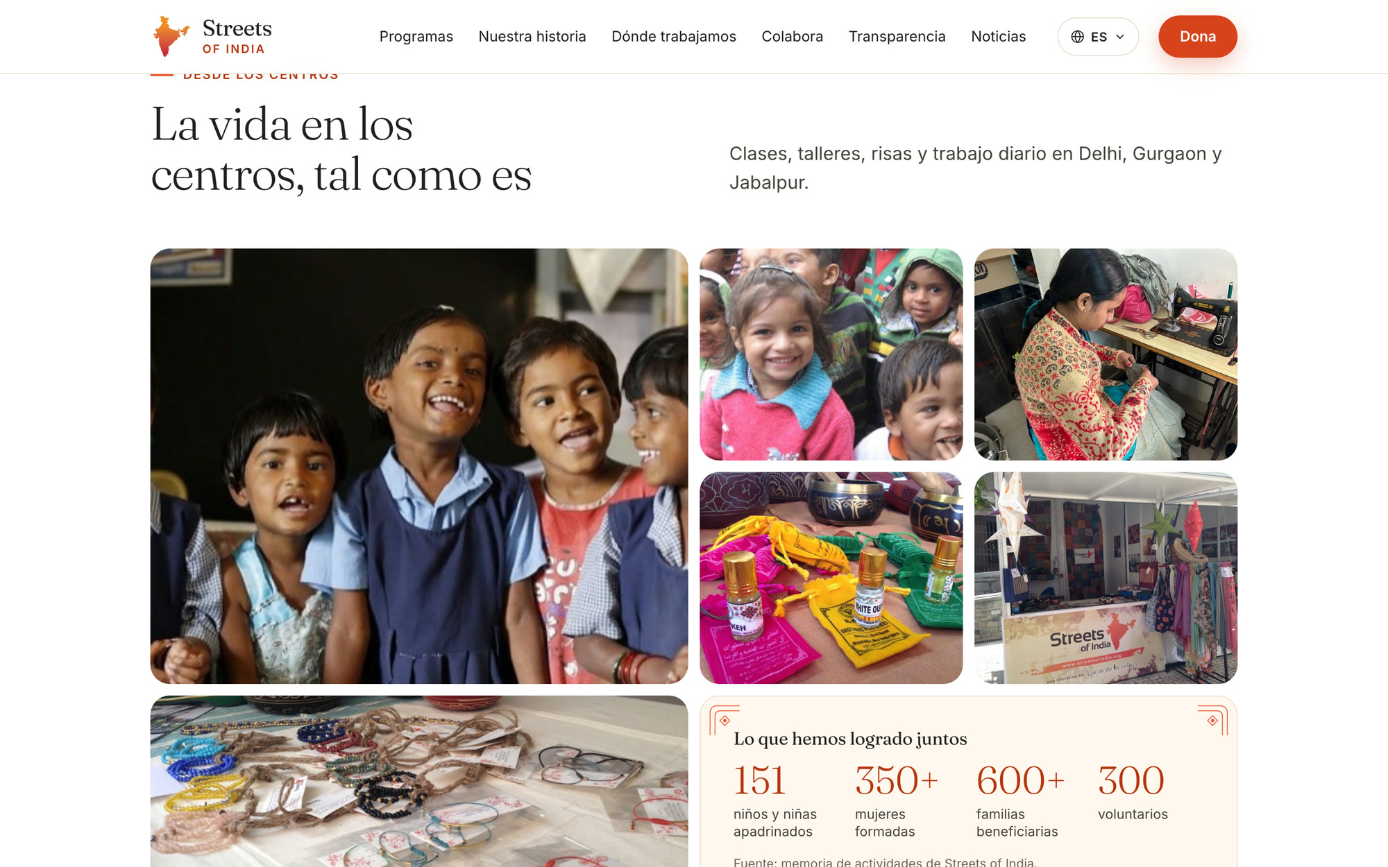
The home opens on real photos and a rotating story: education, disability, women. A photo wall of daily life, the teachers who run the centres and the latest news follow, so visitors see the work before they are asked to give.
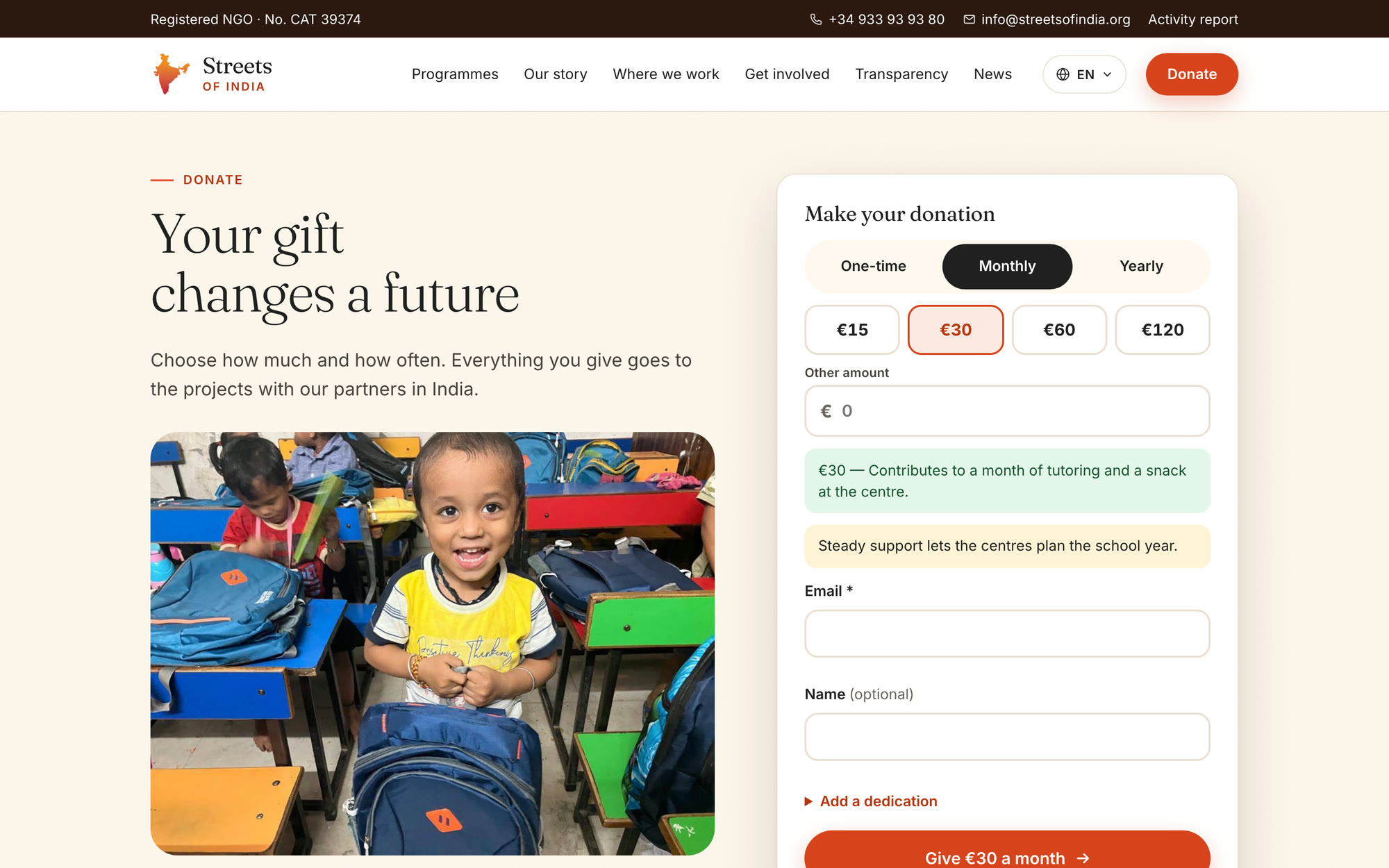
A donation flow without dead ends.
Once, monthly or yearly; an amount; a plain sentence on what it pays for. The pledge is saved, then handed straight to the running campaign. On phones a donate bar follows the reader.
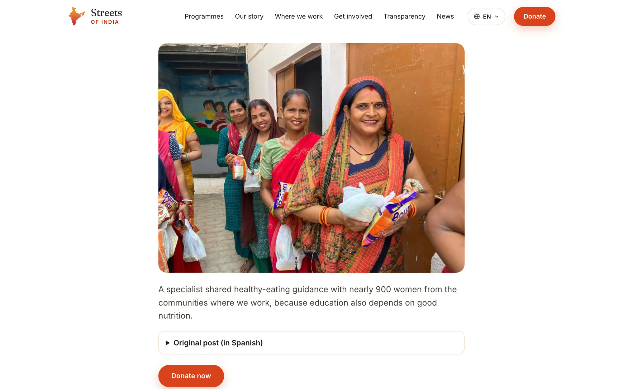
Six years of news, brought home.
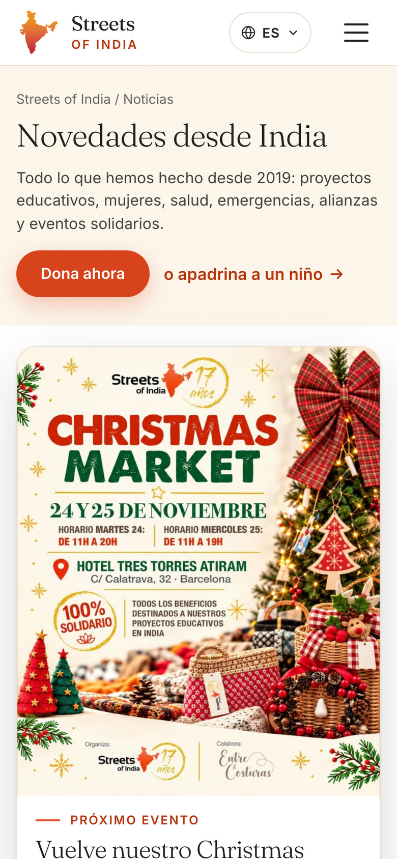
53 updates from 2019 to 2026 became proper stories with full photos and video, joined to the 2013 to 2019 archive in one feed. Nobody is sent away to social media to read a post.
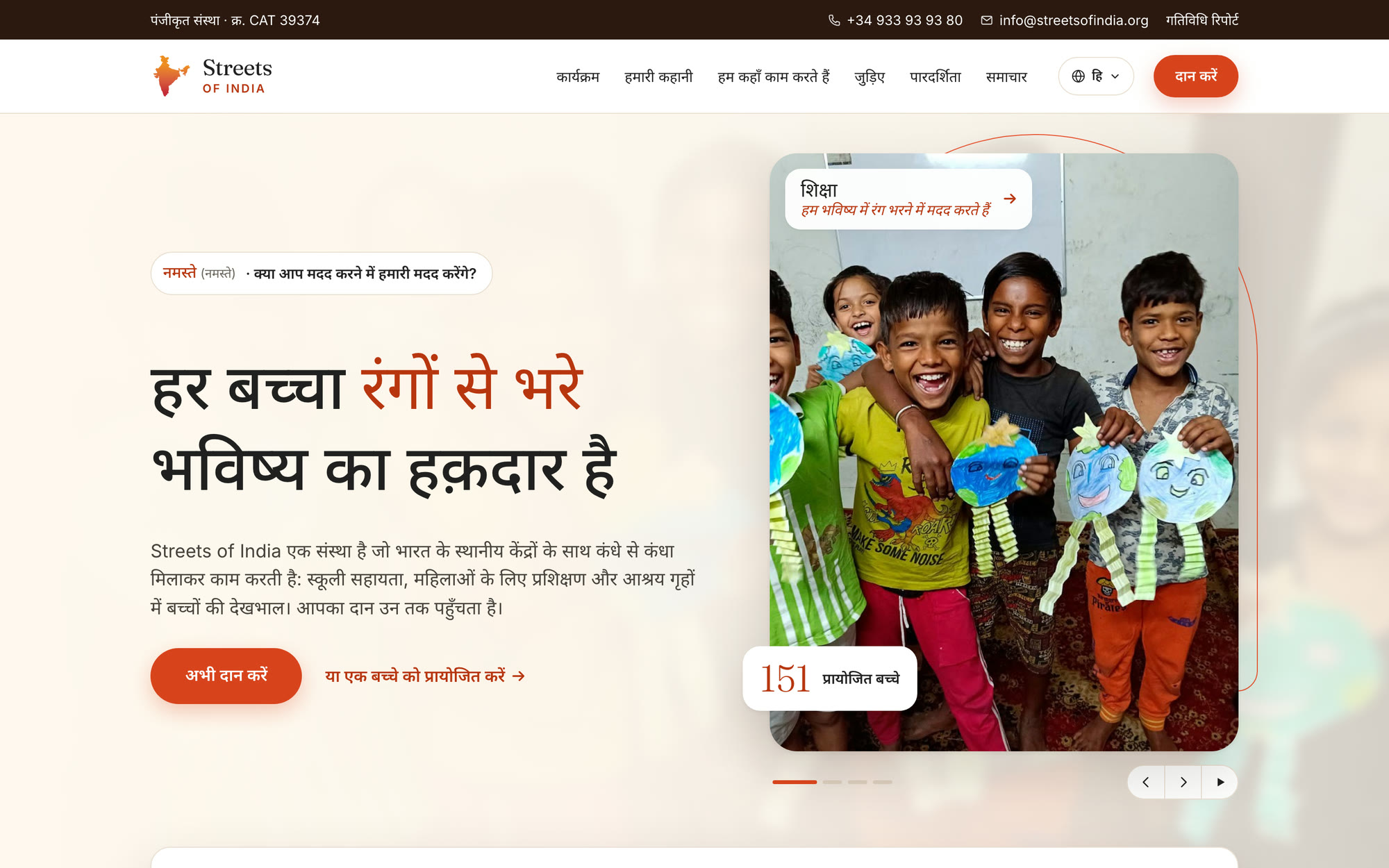
Four languages from one set of pages.
Spanish stays the default. English, Indonesian and Hindi are a dropdown away and the reader stays on the same page. New Indonesian and Hindi translations replace the old automatic ones.
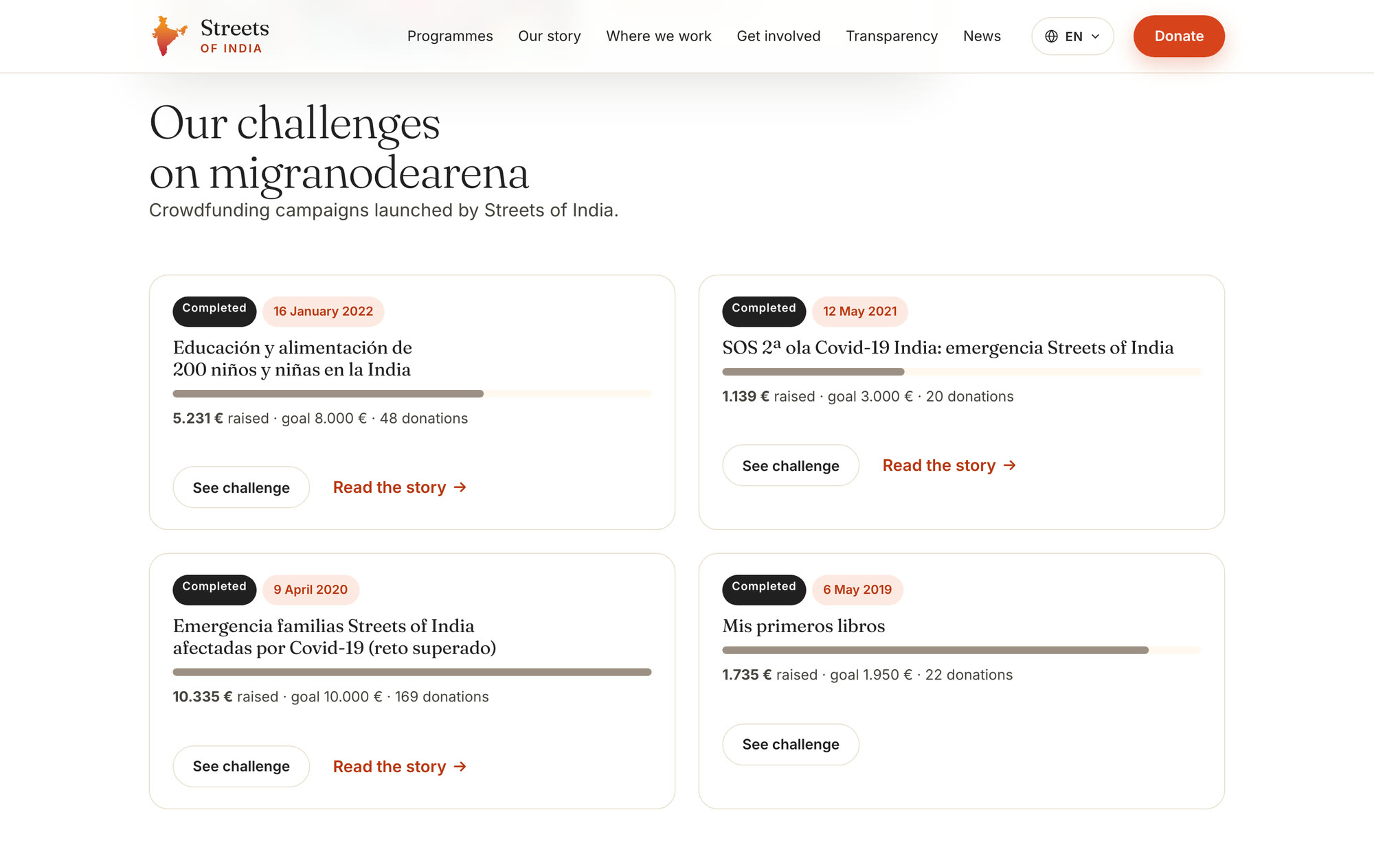
Every campaign, with its result.
The running challenge leads, followed by every past challenge with amount raised, goal and number of donations. Supporters can see what their gifts achieved.
Every way to help, one form behind it.
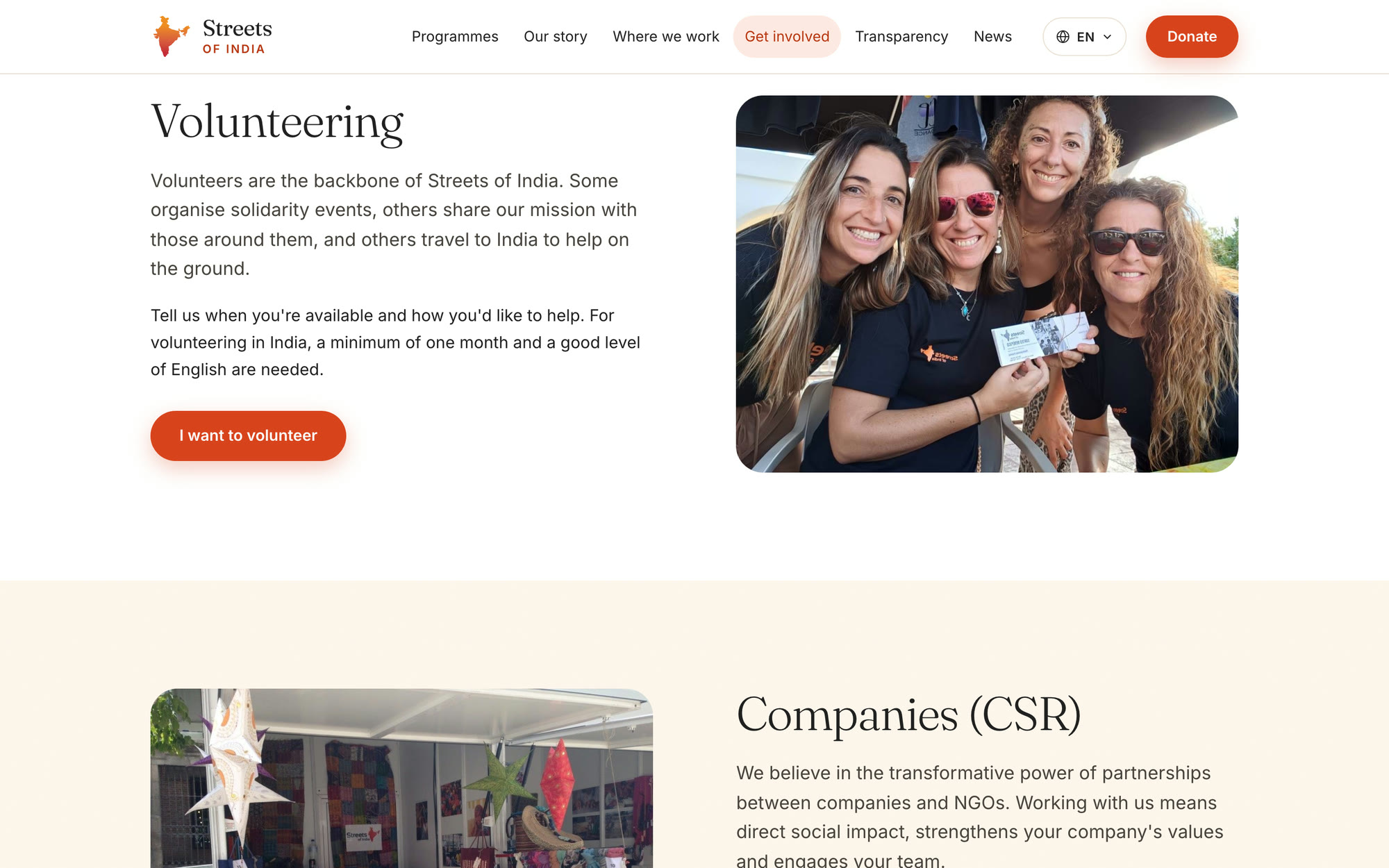
Volunteering, company partnerships, travel to India and membership each get their own section. Every button opens the same contact form with the right topic already chosen.
What changed.
Secure by default
HTTPS on every page. No browser warning stands between a donor and the cause.
Nothing lost
Every old page, post and campaign is on the new site, and old addresses redirect.
A site that looks alive
Recent stories with photos and video sit on the site, not only on Instagram.
Four audiences, one site
Spanish, English, Indonesian and Hindi readers get the same pages in their own language.