 Maverick Business Academy

01 / 07
A clear promise and one next step.
The hero states what Maverick offers in one line, with Apply Now beside it. Course search, Explore Courses and student login sit in the header on every page.

Case study · UI/UX design
We redesigned the Maverick Business Academy London website around how students pick a course: search by level, see the key facts at a glance, then apply.
A student should find the right course and know whether it fits them in under a minute.
The goal we set with the Maverick team
Maverick Business Academy London calls itself the people's learning partner. From its campuses in London and Sharjah it offers accredited diplomas, bachelors, masters and doctoral programmes with partner universities in the UK and abroad, mostly online and part time for working learners.
Its students are usually comparing several courses at once. They want to know the level, the duration, how it is assessed and who awards it, then apply. The old site made them read long paragraphs and open a column of bright blue panels to find those facts.
01Course facts buried in paragraphs. Intake, duration and delivery mode sat inside long text blocks.
Our answerA Course information card puts intake, duration, assessment, delivery and accreditation at the top of every course.
02Hard to find the right course. Courses sat under general menus like Know Us and Why Us.
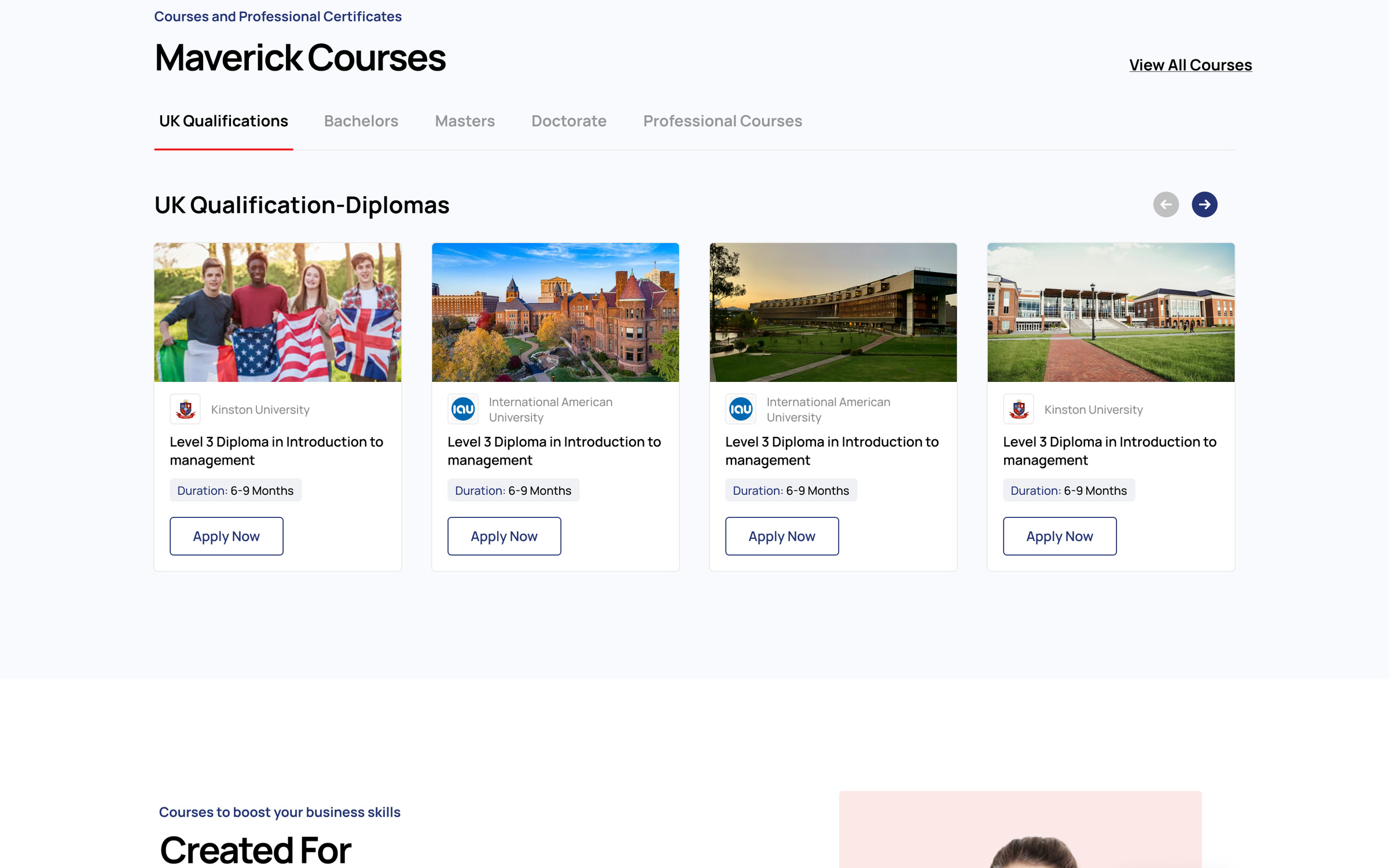
Our answerLevel tabs, from UK Qualifications to Doctorate, each with its own row of course cards.
03No clear next step. Enrol Now sat at the end of the menu and was easy to miss.
Our answerA red Apply Now in the header and on every course card.
04Qualification details scattered. Level, credits and progression were spread across separate panels.
Our answerOne Overview panel with level, credits, RQF number and progression route.
05No picture of what comes next. The old site never showed what happens after a student applies.
Our answerA three-step Admission Process on every course page: apply, check entry requirements, enrol.
Drag the slider to compare the old course page with the new design.
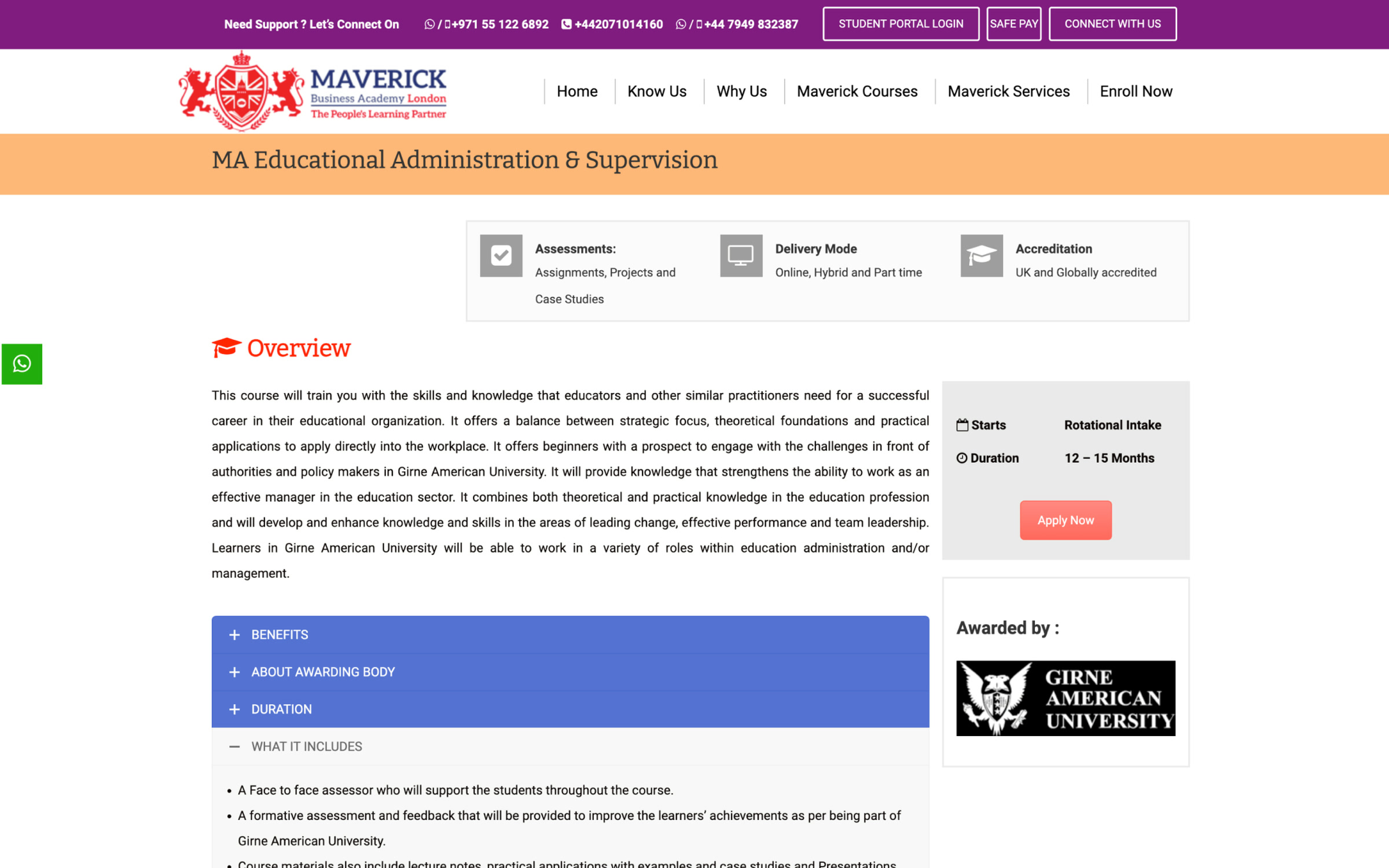
The old course page beside the new course page design.
Brand and design
The Maverick crest pairs a red lion and shield with a navy wordmark. The new design keeps those two colours and lets white space and clear type do the rest, so the site feels as established as the qualifications it offers.

Every course opens with its key facts, then the detail, so students can compare quickly.
Red is kept for Apply Now and the next step, so the call to action is always easy to spot.
Navy carries headings, the search button and the footer, echoing the academy's wordmark.
Every programme uses the same layout, so students learn the page once.
#263476Headings, search#ED1C24Apply Now#050D30Footer#EBEBEBCards, dividers#F5F6FBSections#FFFFFFPages01 / 07
The hero states what Maverick offers in one line, with Apply Now beside it. Course search, Explore Courses and student login sit in the header on every page.
02 / 07
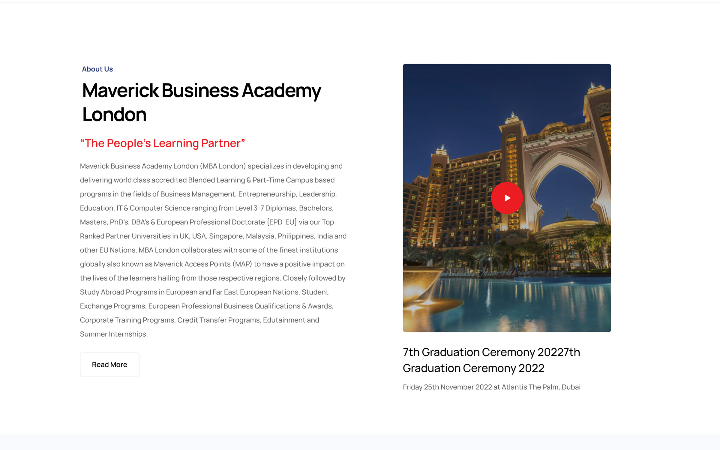
Who Maverick is and how it works with partner universities, next to the graduation ceremony video.
03 / 07
UK Qualifications, Bachelors, Masters, Doctorate and Professional Courses sit in tabs, with course cards that show the university, duration and an Apply Now button.
04 / 07
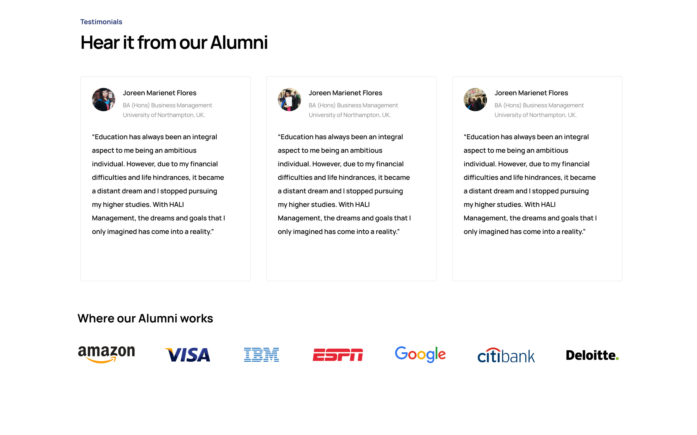
Alumni testimonials with their degree and university, and where Maverick graduates now work.
05 / 07
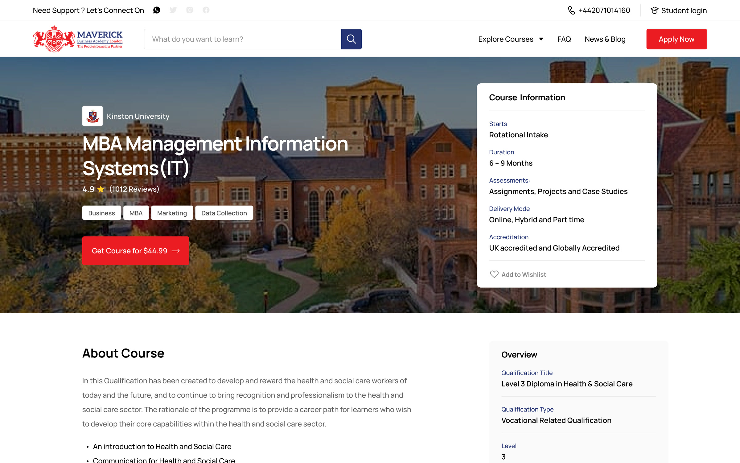
Each course opens with its title, university and a Course information card: intake, duration, assessment, delivery mode and accreditation.
06 / 07
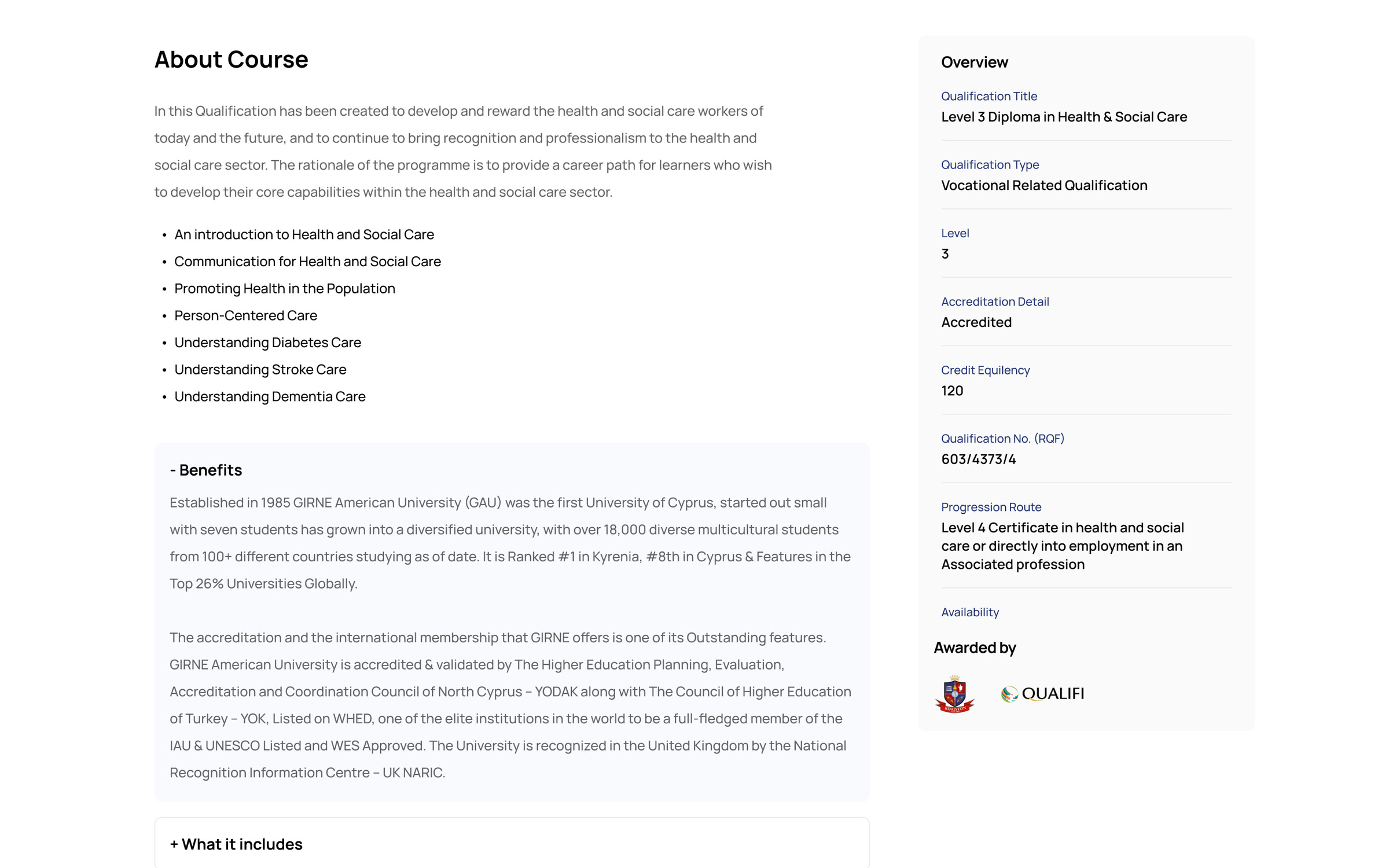
About Course and the module list, folding sections for benefits, modules, entry requirements and fees, and an Overview panel with level, credits and RQF number.
07 / 07
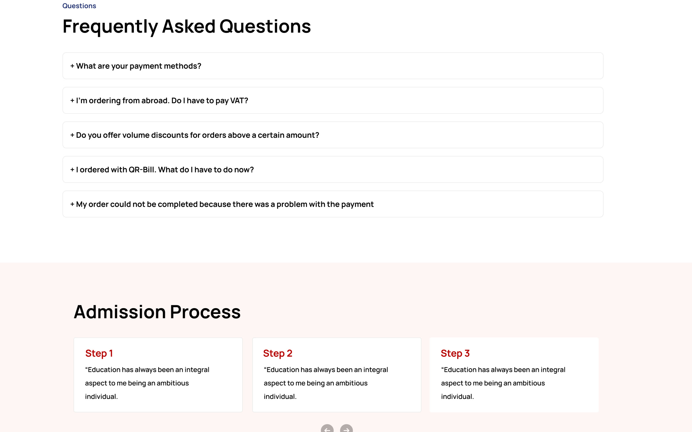
A short FAQ and a three-step admission process close every course page.
Key facts and the qualification overview sit above the detail, so comparing courses takes seconds.
Apply Now is in the header and on every course card.
Search and a five-level course switcher replace general menus.
Two templates, a colour and type system and reusable cards for every programme.
Start a project
Share a few lines about your idea and we'll set up a short call.