01 / 07
The brand, the cart and one clear action.
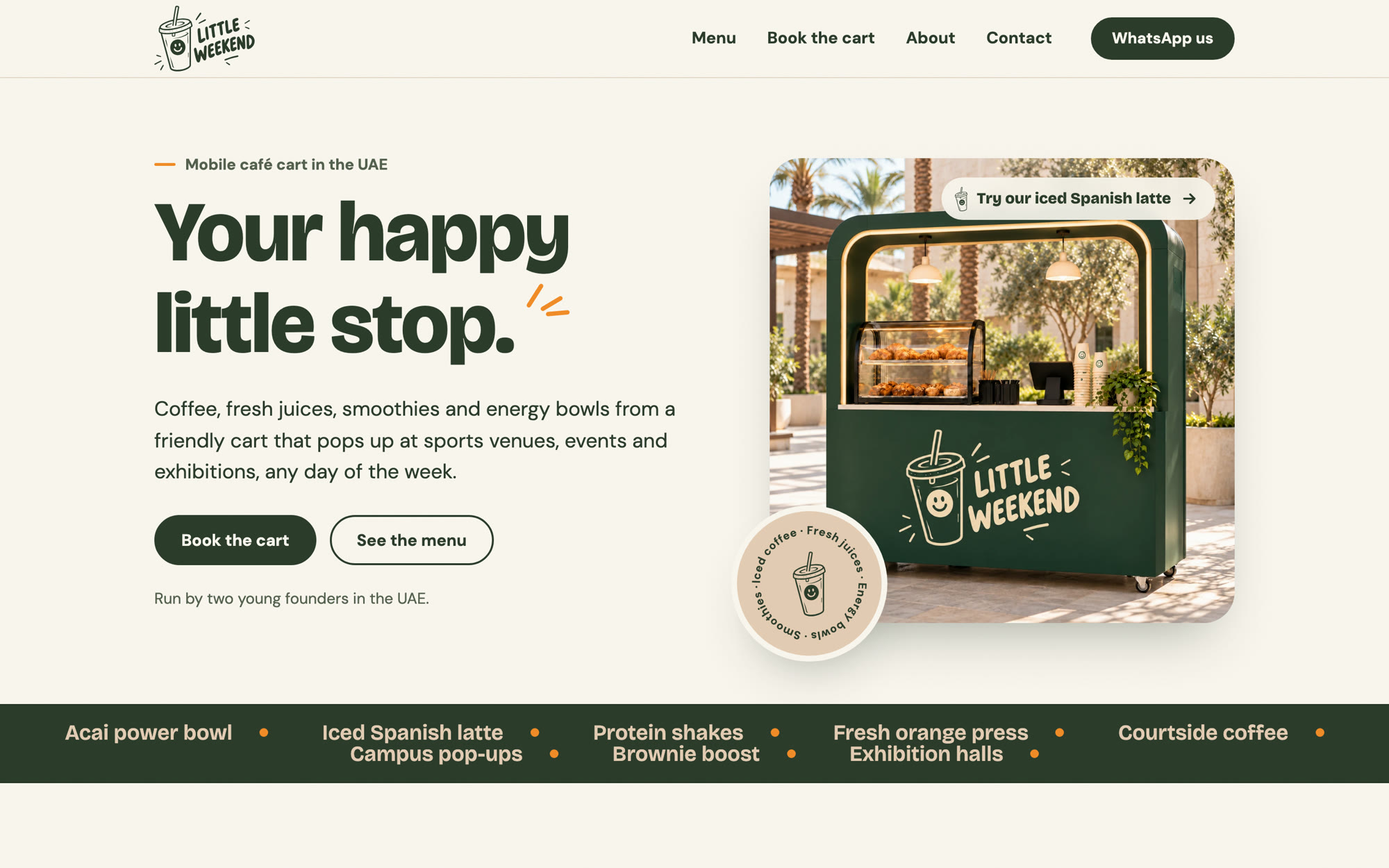
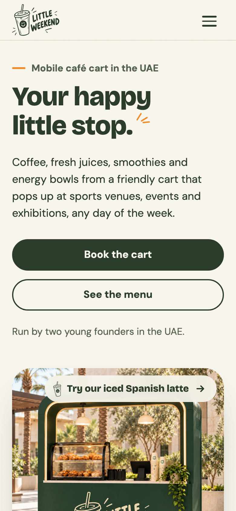
The tagline leads, the cart sits beside it, and Book the cart and See the menu are the first two choices. A slow ticker of favourites runs underneath, with a pause button.
Case study · Website
We designed and built the Little Weekend website: a warm, fast site that shows the menu, the venues and a booking flow that lands straight in WhatsApp.
Little Weekend is a youth-led mobile café cart that serves coffee, fresh juices, smoothies, energy bowls and bakes at sports venues, campus events and exhibitions across the UAE. With the brand in place, the next step was a website that works as hard as the cart.
Two groups use it. Event organisers and venue managers want to know what the cart brings and how to book it. Guests want to see the menu and find out where the cart will be. Both mostly arrive on a phone.
An organiser should be able to book the cart in under two minutes, from a phone.
The team talks to organisers on WhatsApp, so a form that only sends an email would slow every booking down.
Fifty items in nine sections had to stay easy to scan on a phone.
The cart is somewhere new every week, so the site has to show the kinds of places it goes.
A new brand has to look reliable enough for a venue to hand over a space at a real event.
The site had to feel exactly like the cart, the cups and the signs.
We started from the brand and built every page around one action: book the cart.
One path for organisers (see what the cart brings, then book) and one for guests (check the menu, find the cart).
2 journeys, 5 pagesDark Green and Warm Cream, Bricolage Grotesque headings, DM Sans text and the smiling cup, used just like the brand book says.
One look, cart to screenSticky section chips that follow the scroll, clear AED prices and medium and large sizes where they apply.
50 items, 9 sectionsA short form with checks on every field. It blocks past dates and opens WhatsApp with all the details filled in.
3 steps to WhatsAppSmooth page transitions, motion that respects reduced-motion settings, structured menu data for search and a privacy page.
Launched and liveBrand and design
The site follows the Little Weekend brand book to the letter: the hand-lettered smiling logo, Dark Green and Warm Cream, and friendly type. We added a few web-only touches, like a paper-grain texture and soft tinted shadows, so pages feel as warm as the cart.
Pages sit on Milk Foam and Warm Cream instead of stark white, so the site feels like the cart and its cups.
Dark Green carries the main actions, Book the cart and WhatsApp us, so the next step is always easy to spot.
Sunny Orange appears only in small accents, like eyebrow lines and ticker dots, never on large areas.
Prices in AED, sizes as medium and large, and the same dark green board look as the menu on the cart.
#2C3C2CButtons, headings#223022Footer, bands#E4CCB4Venue band, chips#FAF6EFPage background#F28C28Small accents#55614FSupporting text01 / 07
The tagline leads, the cart sits beside it, and Book the cart and See the menu are the first two choices. A slow ticker of favourites runs underneath, with a pause button.
02 / 07
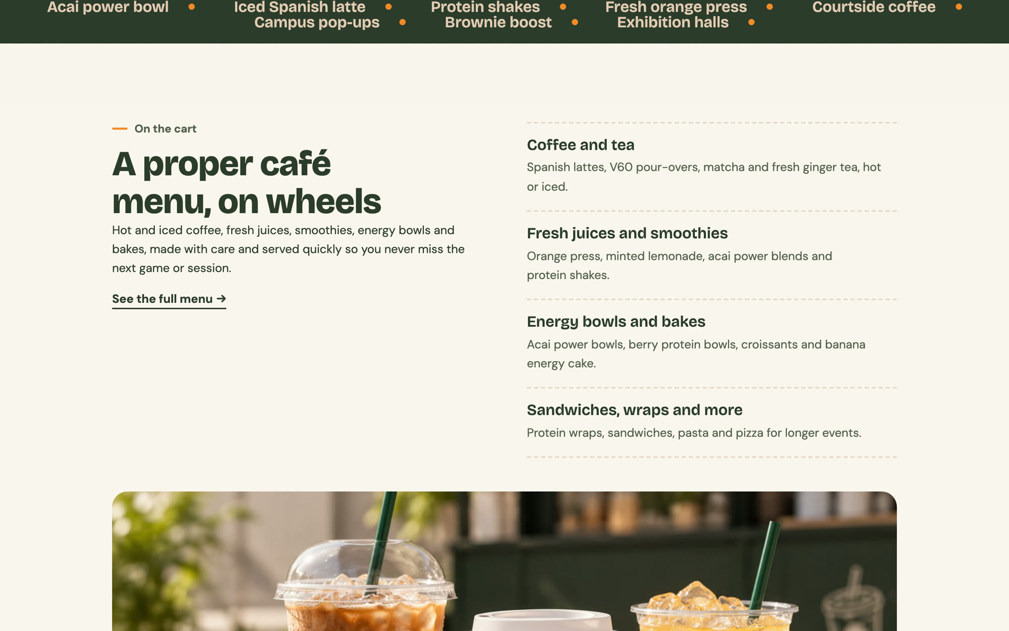
Four groups, from coffee and tea to wraps and pasta, give guests a quick idea of the menu, with one link to the full list.
03 / 07
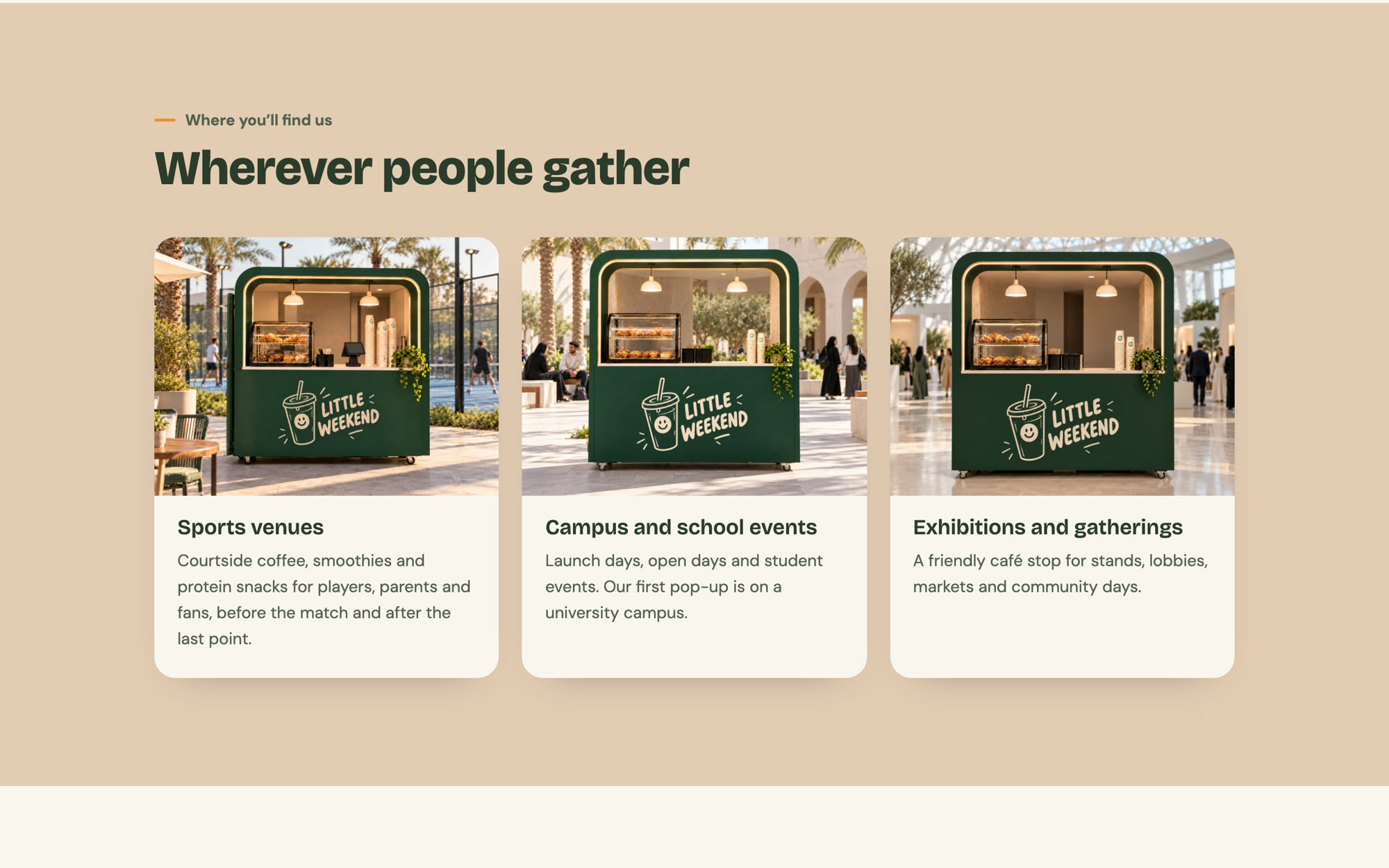
Sports venues, campus events and exhibitions each get a card, so organisers can picture the cart at their own event.
04 / 07
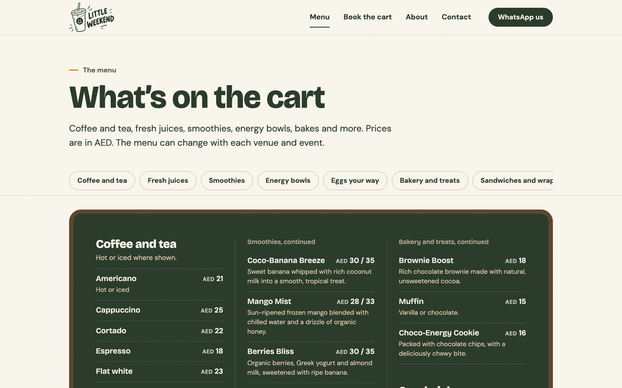
The menu reads like the board on the cart. Section chips stay at the top and highlight as you scroll, and every price is in AED.
05 / 07
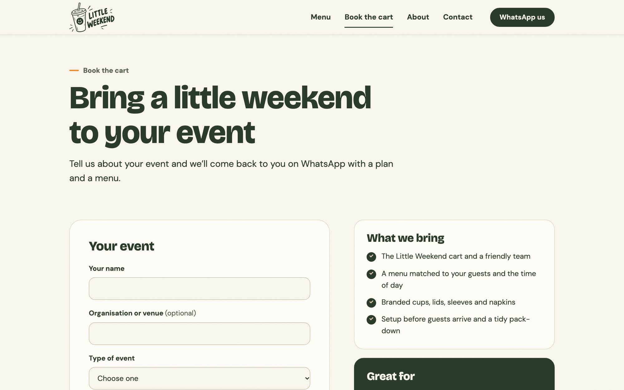
Organisers fill in the date, venue, guest numbers and event type. Each field shows its own error, past dates are blocked, and sending opens a WhatsApp chat with everything filled in.
06 / 07
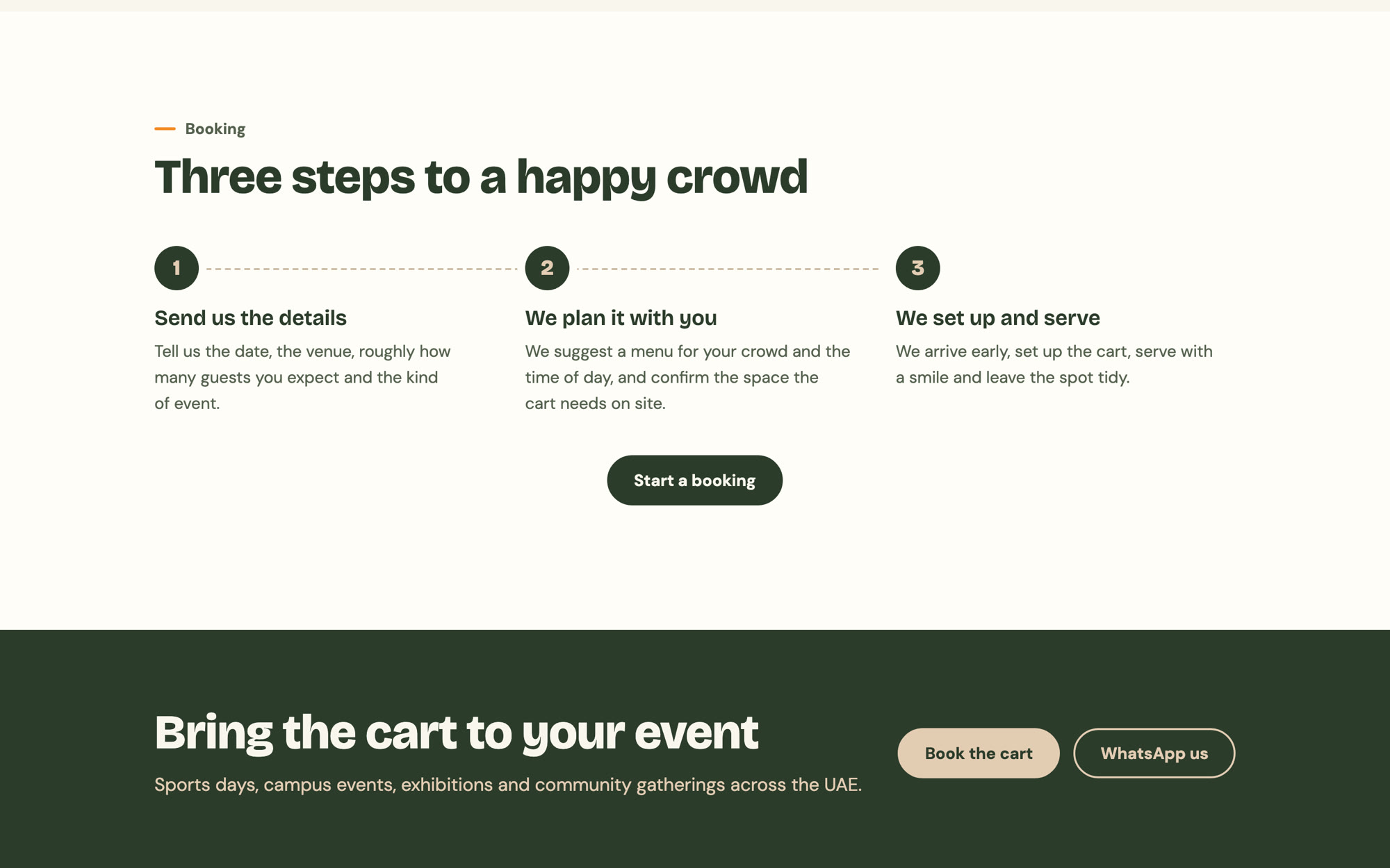
A simple timeline shows what happens after a booking: send the details, plan the menu together, then the team sets up and serves.
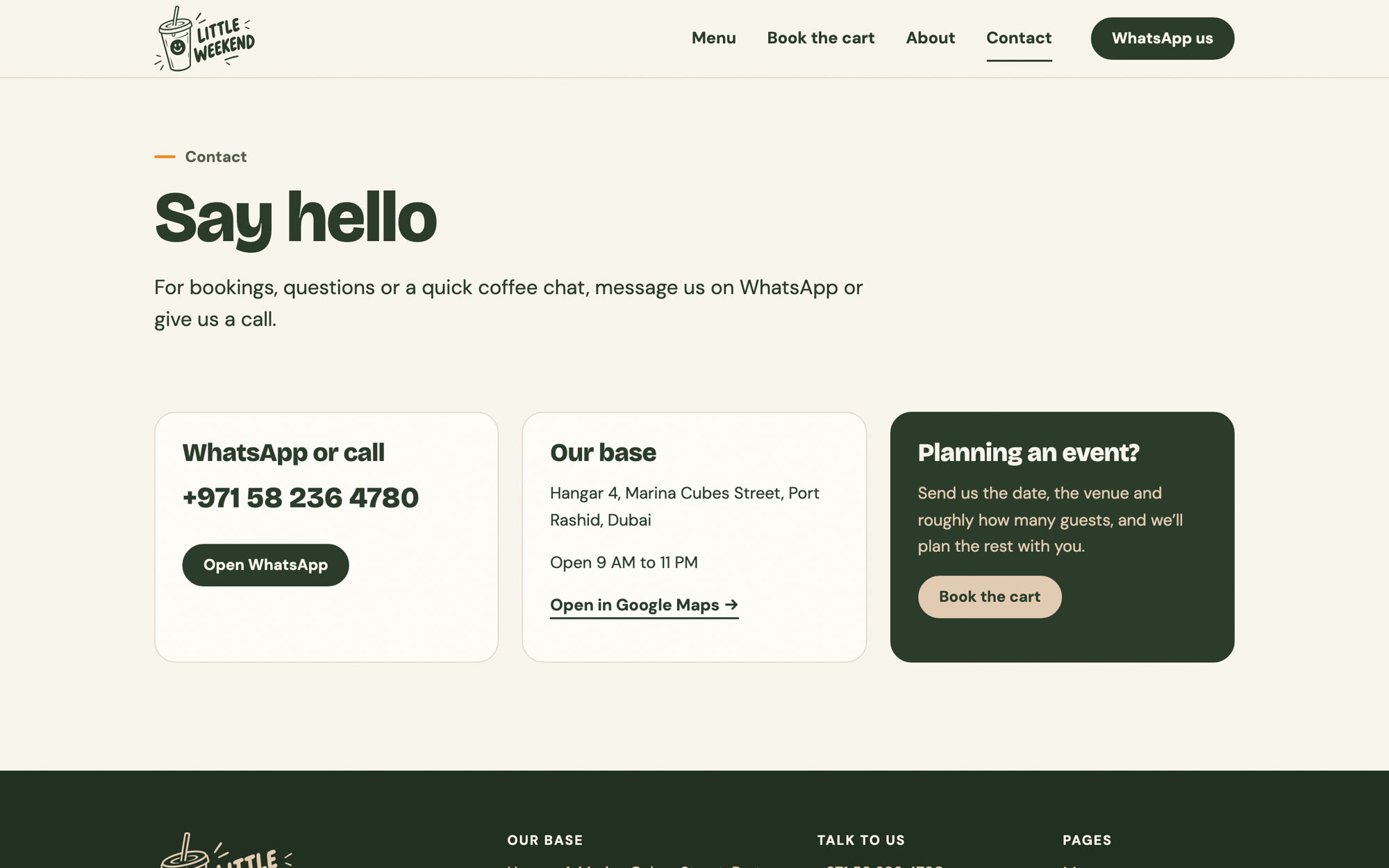
07 / 07
WhatsApp, a phone call or a visit to the base, each one tap away, with opening hours and a map link.
Organisers send a complete request from their phone, and it arrives in WhatsApp, where the team already works.
All 50 items and prices are online, so guests know what they want before they reach the cart.
The site uses the same colours, type and smiling cup as the cart, cups and signs.
Light static pages load quickly on any phone, and the menu and copy live in one file.