01 / 09
Served with a smile.
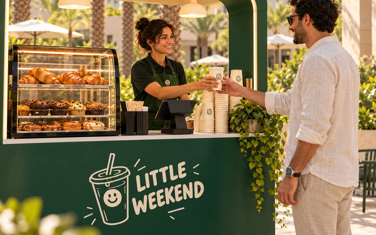
The smiling cup is everywhere a guest looks: on the cart front, the apron, the cups and the counter, so the brand feels as friendly as the person serving.
Case study · Brand identity
We shaped the Little Weekend identity: a hand-lettered smiling logo, a warm palette, a friendly voice and a brand book, tested across 26 real-world scenes.
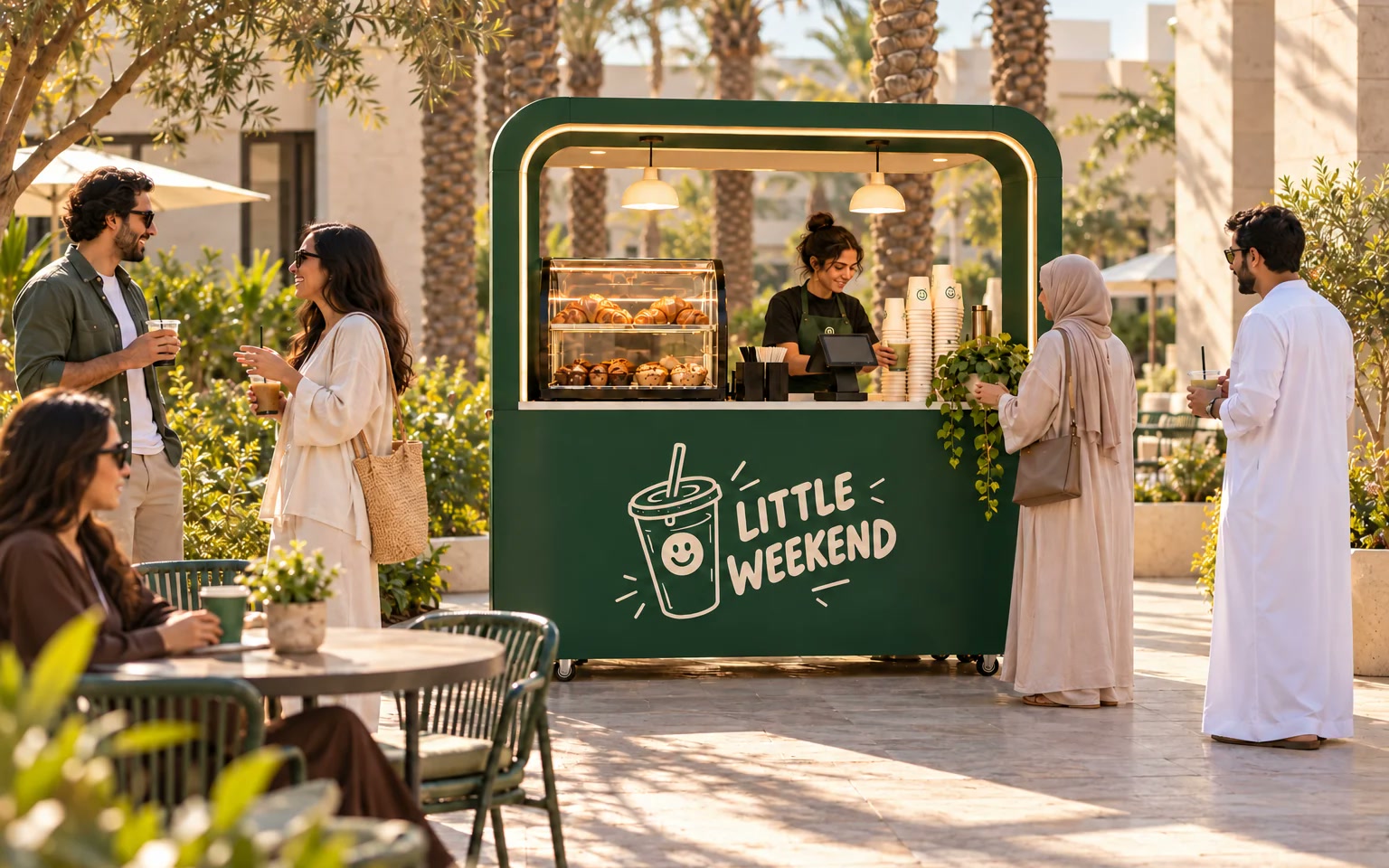
Little Weekend was started by two young entrepreneurs. They wanted the best part of a day out, a good drink, something sweet and a friendly face, to be easy to find wherever people gather.
The cart serves coffee, refreshing drinks and pastries at sports venues, events and exhibitions across the UAE. It opens at a university event, then moves to a new venue every week. Its guests are young adults, sports fans and eventgoers, and its booking partners are the organisers who want a cart that adds warmth to their space.
Turn a quick drink into a small, happy pause, on any day of the week.
The cart is somewhere new every week, so people have to spot it from across a court or an exhibition hall.
The same mark has to read on a 32 pixel app icon, a cup sleeve and a three-metre backdrop.
Guests want something fun and fast. Organisers want a partner that looks reliable and professional.
The name says weekend, but the cart works every day, so the voice could never sound weekend-only.
In the UAE the brand needs to sit comfortably in English and Arabic.
Every decision came back to one question: does it make someone's day a little better in a few minutes?
We worked with the founders on who the cart is for, where it shows up and how it should feel, and wrote it down as one brand idea.
A small, happy pauseWe refined the hand-lettered wordmark and the smiling cup: stroke weights, lid swirls, dots and highlights, so it holds up at every size.
One master logoDark Green and Warm Cream lead, Sunny Orange adds energy in small doses, and Bricolage Grotesque, DM Sans and Readex Pro carry the words.
6 colours, 3 typefacesA tagline, Your happy little stop., plus a personality and clear do and don't examples that anyone running the cart can follow.
One tagline, six traitsWe put the brand on cups, bags, signs, uniforms, banners, social posts and an app icon, and checked contrast and small-size legibility.
26 mockupsBrand and design
The logo is one hand-lettered drawing: the words LITTLE WEEKEND beside a cup with a smile, a lid, a straw and little lines of energy. Everything else in the system is there to let that smile do its job.
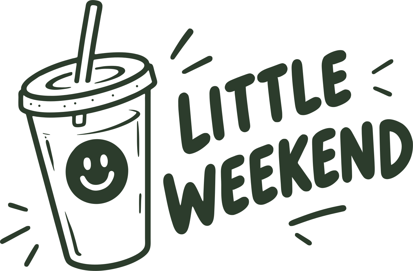
The smiling cup is the heart of the brand. It always stays upright, and no other food or drink icons crowd it.
The wordmark is drawn, not typed, so it keeps its warmth. It is never redrawn, rearranged or set in a font.
Dark Green and Warm Cream carry the brand. Sunny Orange appears in small doses, for the moments that need energy.
Your happy little stop. always appears as separate copy, on packaging, signs and sign-offs, never locked to the logo.
#2C3C2CPrimary#E4CCB4Secondary#F28C28Accent#FAF6EFLight neutral#201B17Dark neutral#FFFFFFUtility01 / 09
The smiling cup is everywhere a guest looks: on the cart front, the apron, the cups and the counter, so the brand feels as friendly as the person serving.
02 / 09
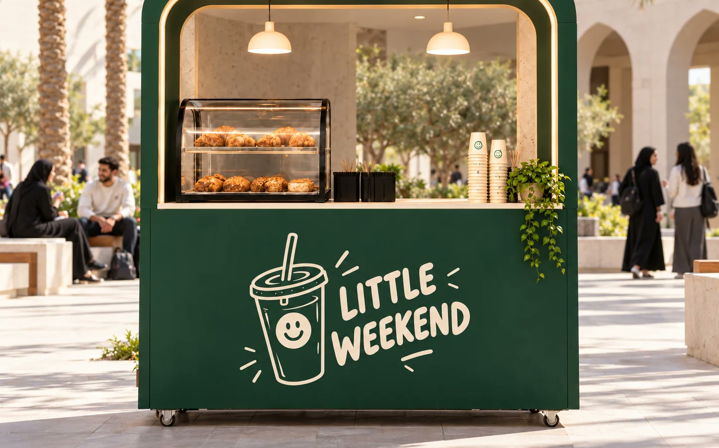
The cart opens in a university courtyard: the smiling cup on the front, pastries on show and branded cups stacked and ready, in the same green and cream as every other stop.
03 / 09
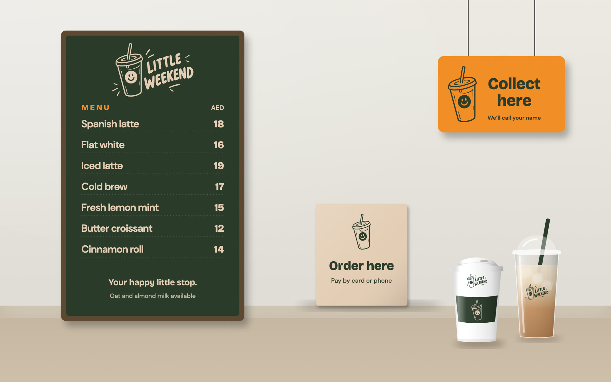
A clear menu board with prices in AED, a counter sign and a bright collection sign keep the queue moving at busy events.
04 / 09
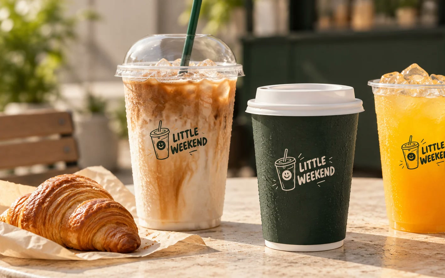
An iced latte, a green hot cup and a fresh orange juice each carry the smiling cup, so every drink takes the brand across the venue.
05 / 09
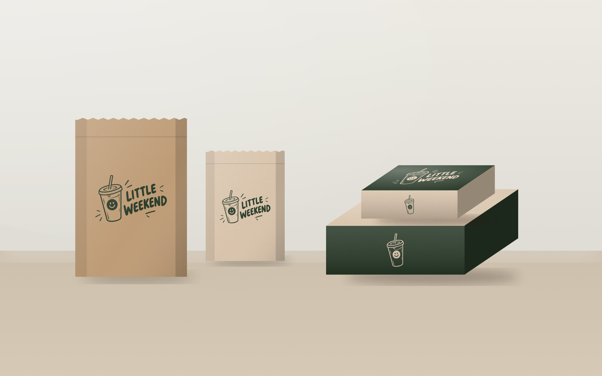
Kraft and cream pastry bags and two takeaway boxes use the mark on its own, simple and easy to print in small runs.
06 / 09
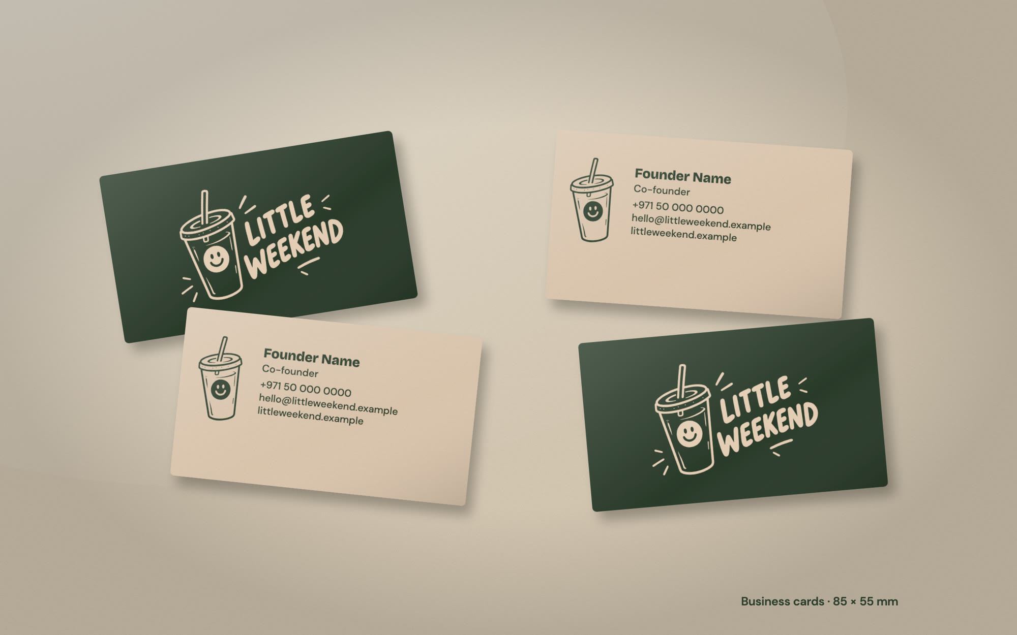
Green and cream business cards help the founders follow up with the event organisers and venue managers they meet.
07 / 09
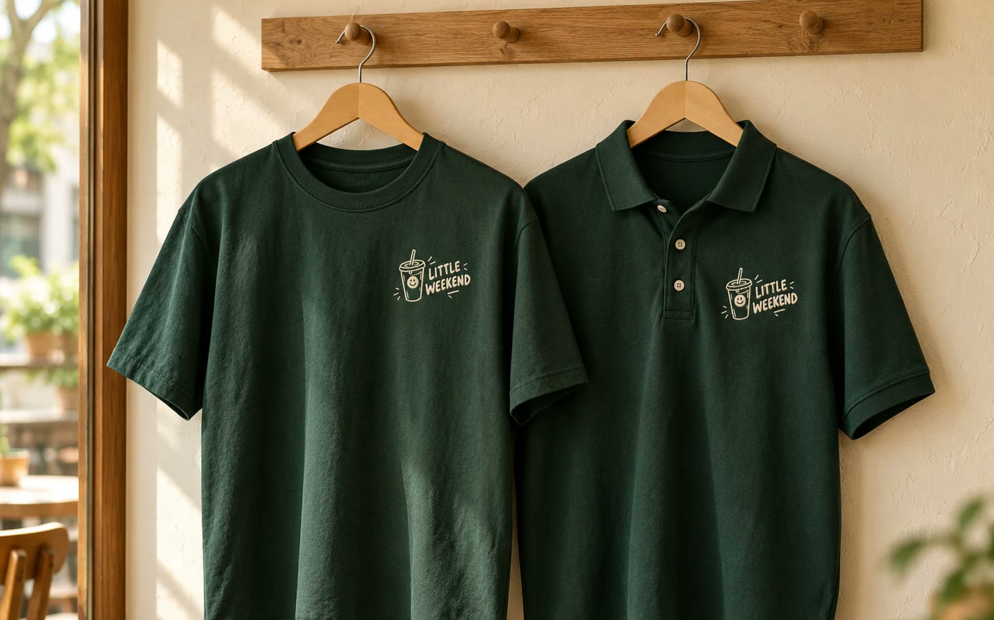
Dark Green T-shirts and polos carry the logo on the chest in Warm Cream, so guests know who to ask at a crowded event.
08 / 09
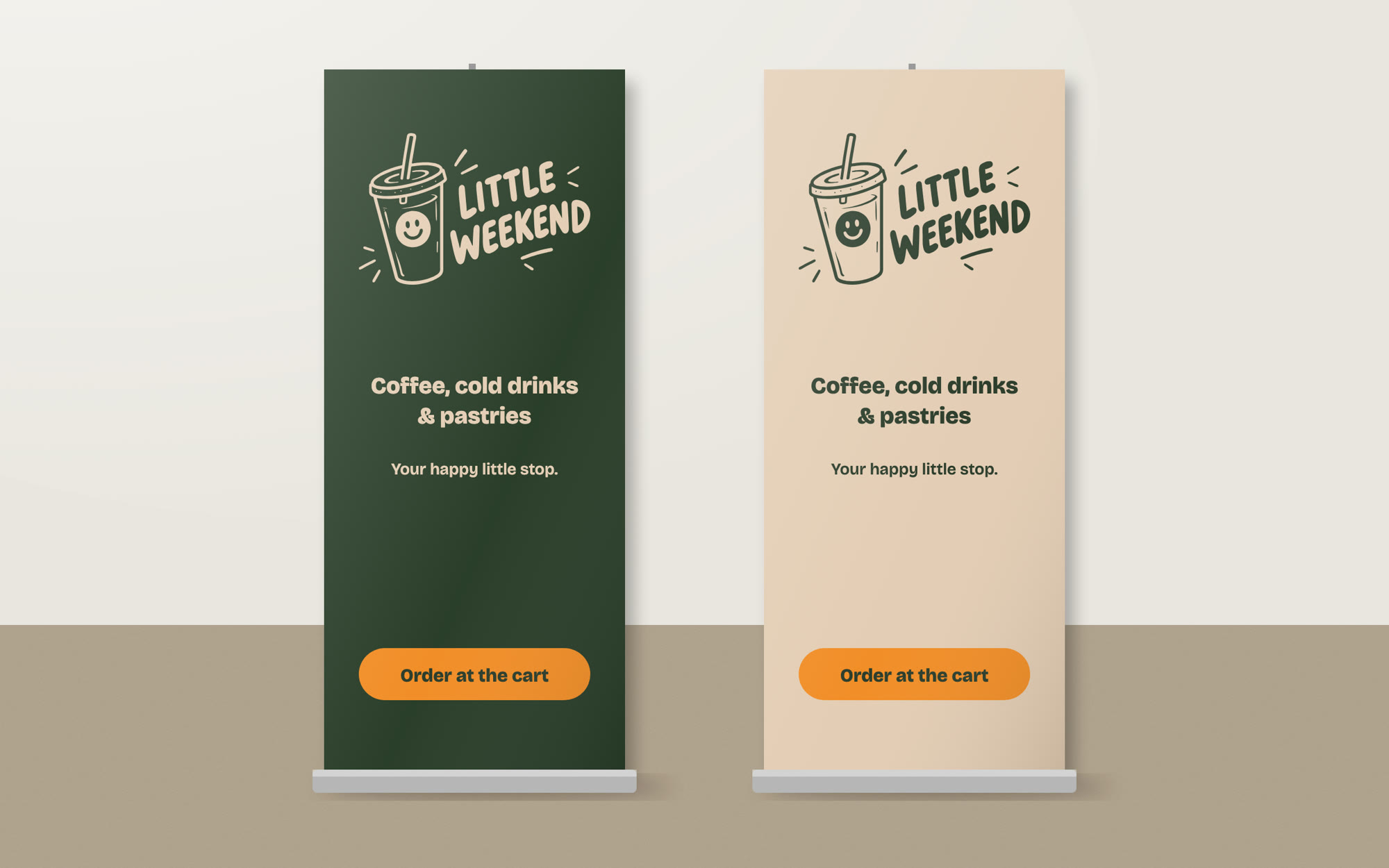
Roll-up banners in Dark Green and Warm Cream fit any stand, with the logo at eye level and a clear Order at the cart button.
09 / 09
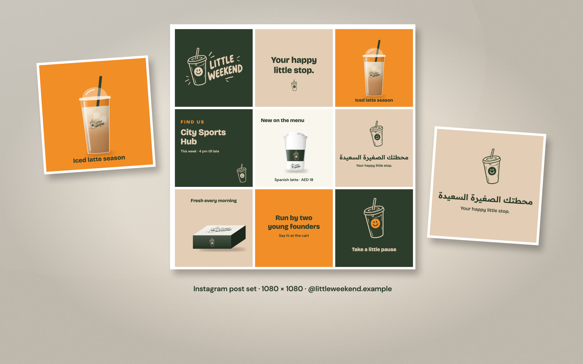
A nine-post grid mixes the logo, drinks, venue updates and the tagline, in English and Arabic, so the feed looks like one brand.
The cart looks the same at a campus launch, a padel court or an exhibition, so people recognise it wherever it goes.
Logo files, app icons, a brand book and print-ready layouts mean the founders can order cups, signs and uniforms straight away.
Colour pairs are checked for contrast, and a simplified icon keeps the smile clear down to 32 pixels.
The brand book shows correct and incorrect use, so anyone running the cart or making a post gets it right.