01 / 06
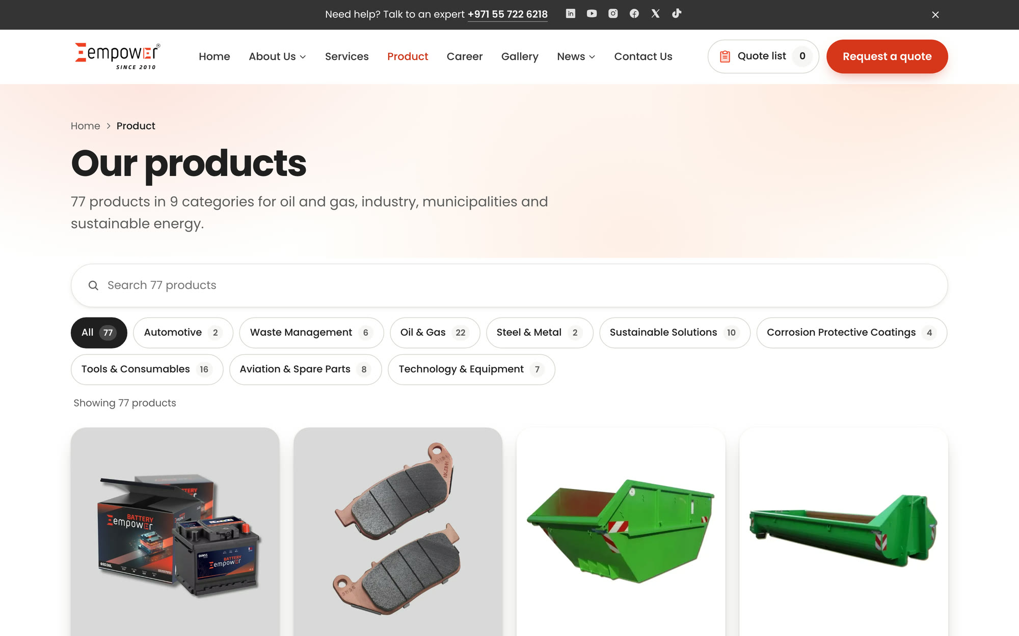
77 products, found in seconds.
Nine categories with counts, live search across every product and an empty state that suggests what to try next. Each card shows the product photo, category and whether a catalogue is available.
Case study · Industrial supply
We rebuilt Empower Group's website with 104 pages, a real quote journey and a design that puts products first.
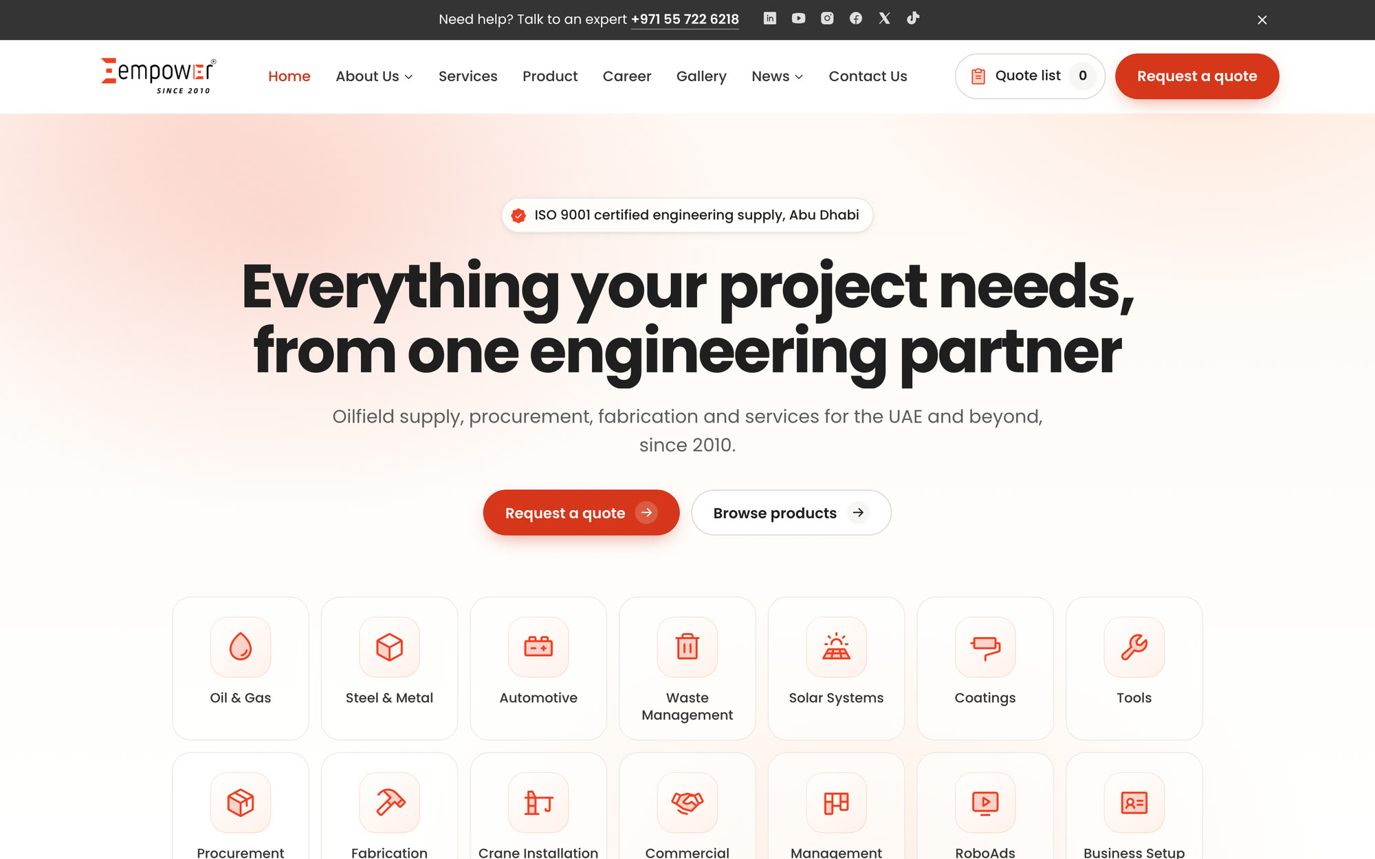
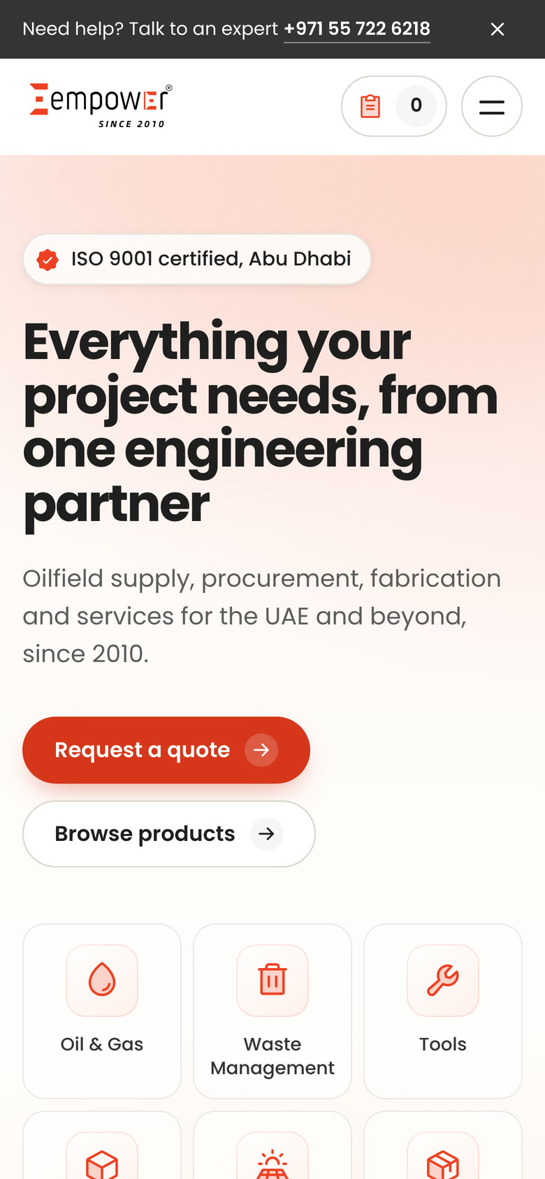
Empower started in Abu Dhabi in 2010 as an ISO 9001 certified onshore and offshore oilfield engineering supply and services company. It has grown into a group of seven companies: commercial agency, corporate services, branding, procurement and export from the United States, education, steel fabrication and digital signage.
Its buyers are procurement teams at energy companies, municipalities and contractors. They need to find the right product, check it fits and send a request for quotation fast. The old website made each of those steps harder than it should have been.
A buyer should find the right product and send a quote request in a few minutes, from any device.
Every page returned a server error and some sections never loaded, so visitors saw half a site.
Most product pages reused the battery page's text, so buyers couldn't tell products apart.
A generic contact form was the only route to a quote, with no product, quantity or specs.
Placeholder pages, demo content and unwanted links sat next to real products.
Seven companies, with little sense of how they fit together or which one to call.
Drag the slider to compare the old home page with the new one.
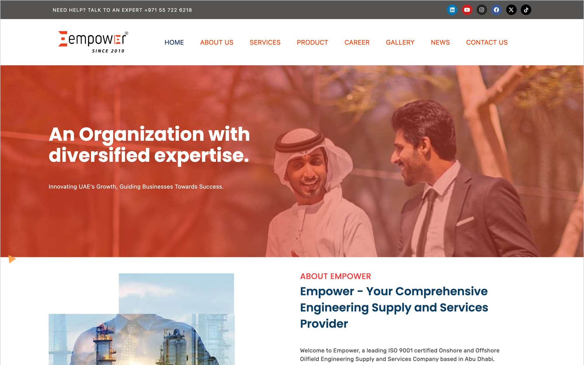
The old home page as it appeared before the rebuild.
We kept everything that was real, cut everything that wasn't, and designed every page around one action: send a request for quotation.
We listed every page and product on the old site, kept all the real content and set aside test pages, demos and duplicated copy.
Every real page keptEmpower red for actions, charcoal for text, Poppins for everything, duotone icons and mostly light, open pages.
One red, one fontA quote list with quantity bands and per-item specs, sent in three steps, with every product page one click from a request.
3-step RFQOne adaptive product template that shows only the sections each product has, with its own photos, drawings and catalogues.
104 pages, same addressesEvery link, image and anchor checked, every page type tested on phones, plus a launch checklist for the team.
Every link checkedBrand and design
Empower's logo is bold red and charcoal, and the brand line is simple: innovating the UAE's growth and guiding businesses to success. The new design keeps that confidence and adds calm: light pages, generous space and red only where it matters.

The brand red marks the next step, like Request a quote or Add to quote list, so buyers always know where to go.
White and soft-tinted backgrounds let product photos and specs breathe, a change from the old heavy colour overlays.
Real product photos on tinted tiles, drawings and spec tables come before any marketing copy.
Counters, a live order tracker and a smooth scroll show how Empower works, and all of it switches off for reduced motion.
#EF4023Brand, highlights#D6361BButtons#CC3317Small red text#343434Headings, text#FFFFFFPage background01 / 06
Nine categories with counts, live search across every product and an empty state that suggests what to try next. Each card shows the product photo, category and whether a catalogue is available.
02 / 06
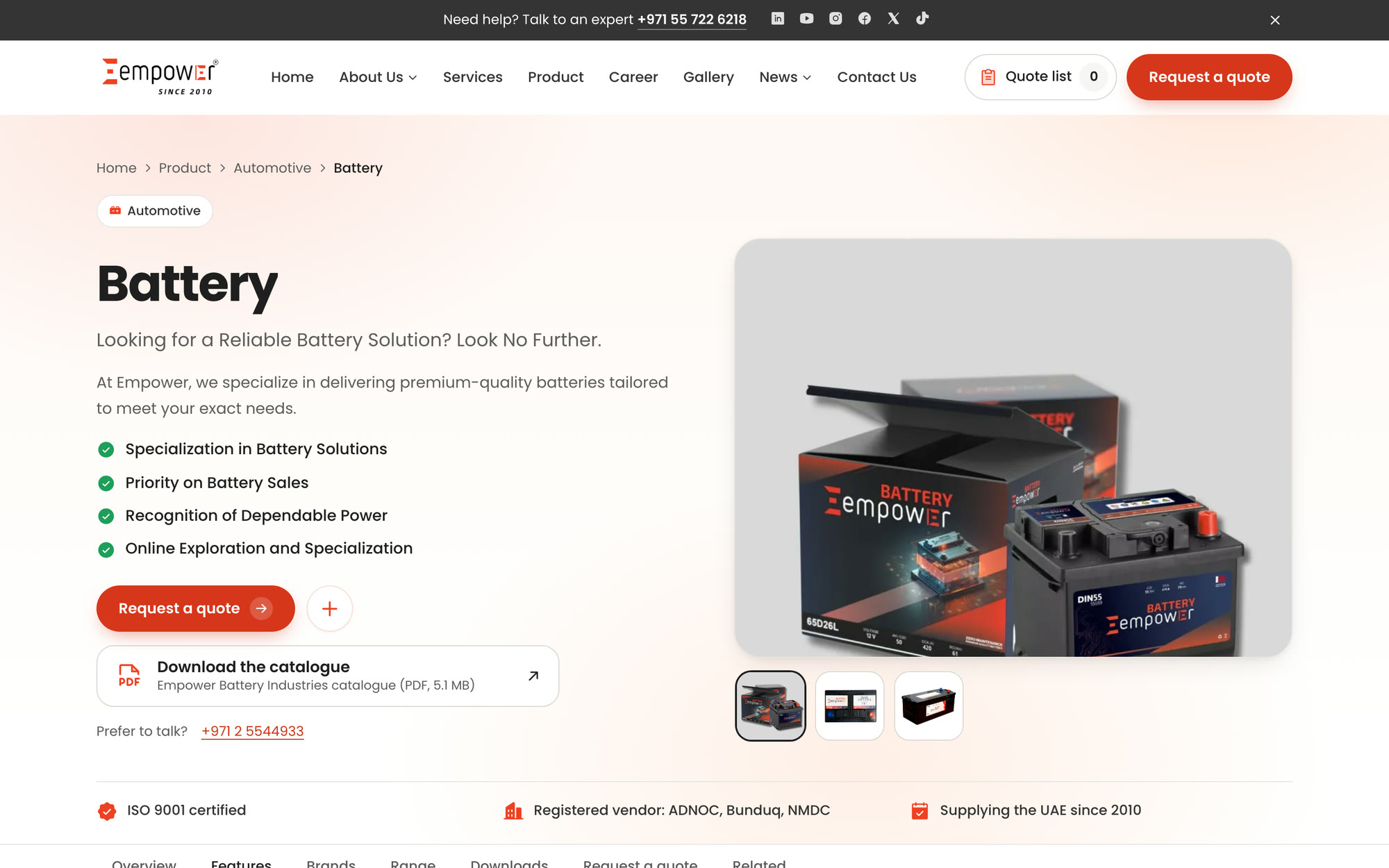
A gallery, key features, specifications, drawings, brands and downloadable catalogues, shown only when the product has them. Every page has its own photos, and a request for quotation is one click away.
03 / 06
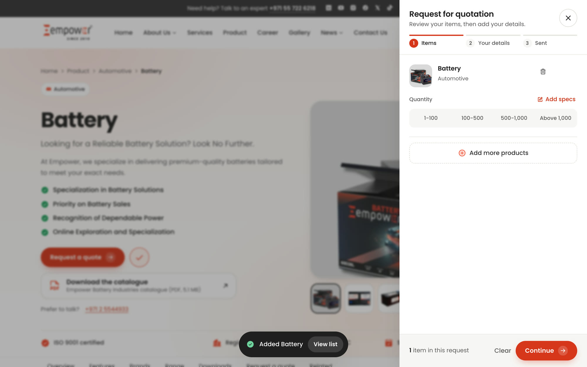
Buyers add products to a quote list, choose a quantity band from 1-100 to above 1,000, add specs, then send it with their details. Removing an item can be undone, and the list is remembered on the device.
04 / 06
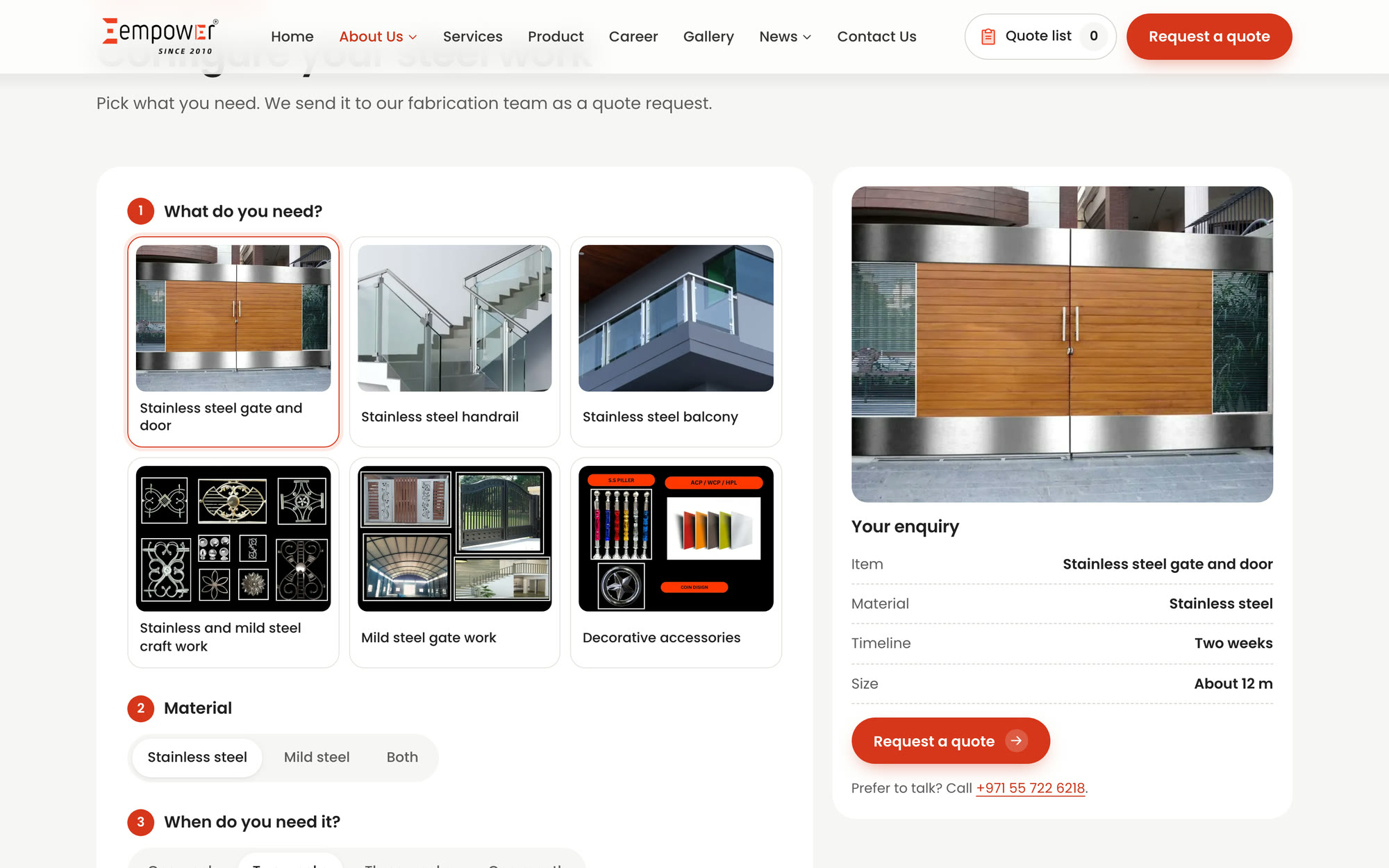
Pick the item, material, timeline and size for gates, railings and balconies, and see a live summary that goes straight into a quote request for Empower Steel.
05 / 06
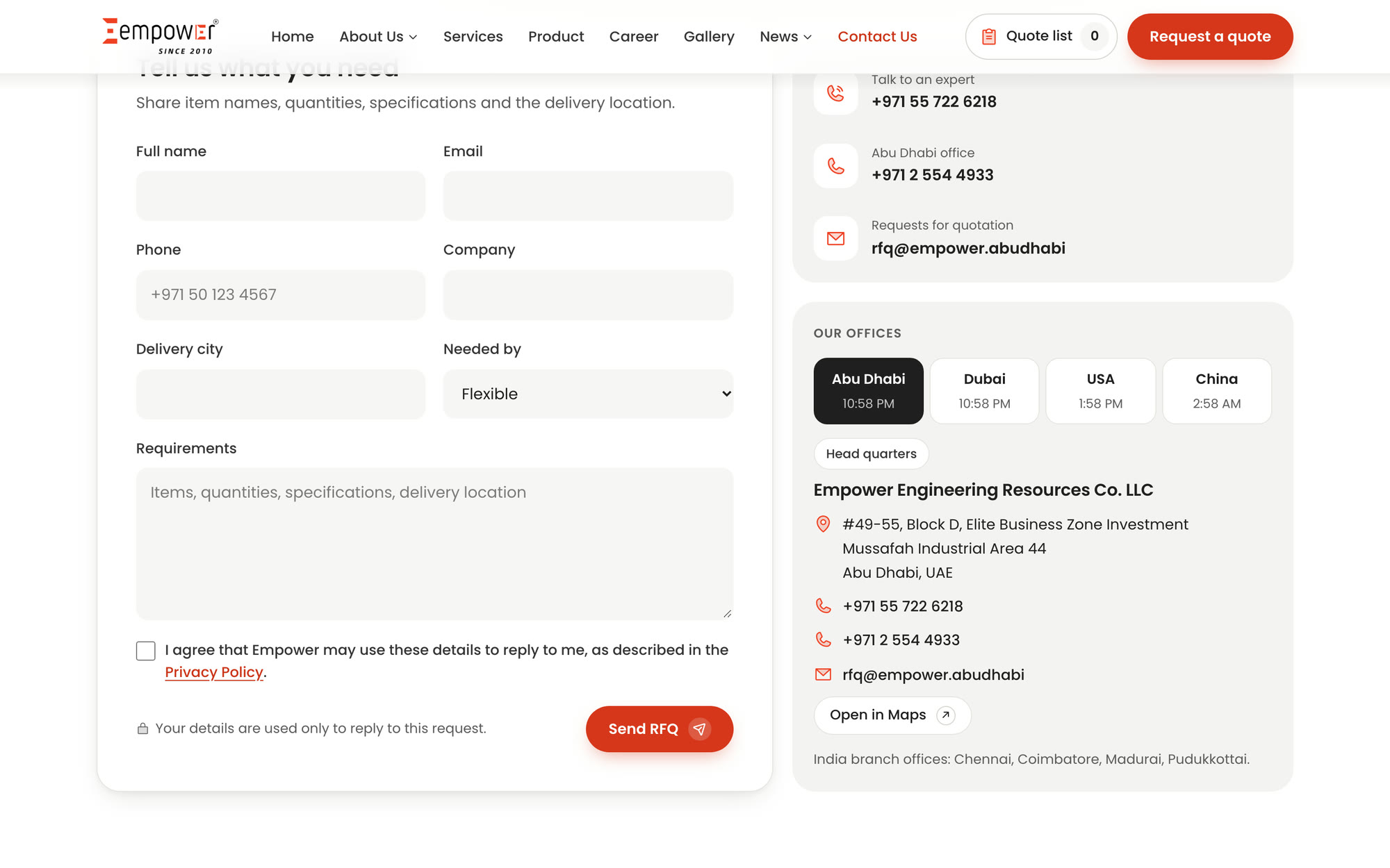
An office switcher for Abu Dhabi, Dubai, the USA and China shows each address and the local time, next to a request form with delivery city and timing.
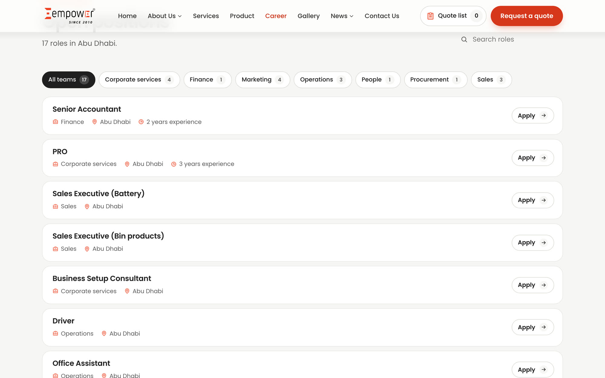
06 / 06
Filter roles by team, search by title and apply in a short dialog, without leaving the page.
All 104 pages load in full, at the same addresses, so old links and search results still land in the right place.
Buyers go from product to a sent quote request in three steps instead of a blank contact form.
Duplicated text is gone. Each product has its own copy, photos, specs and catalogue.
Test pages, demo content and unwanted links are gone, and search engines get clear structured data.